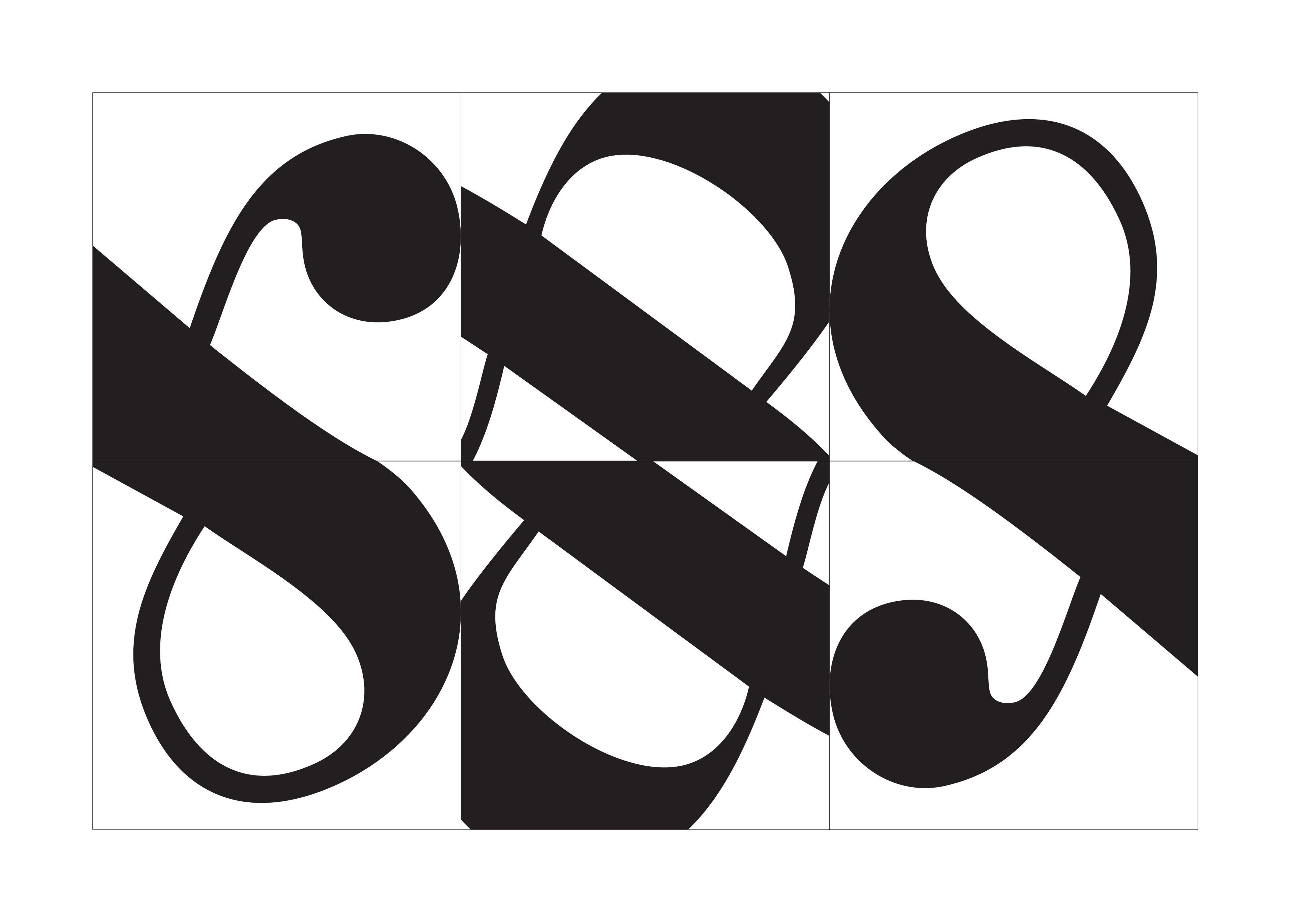
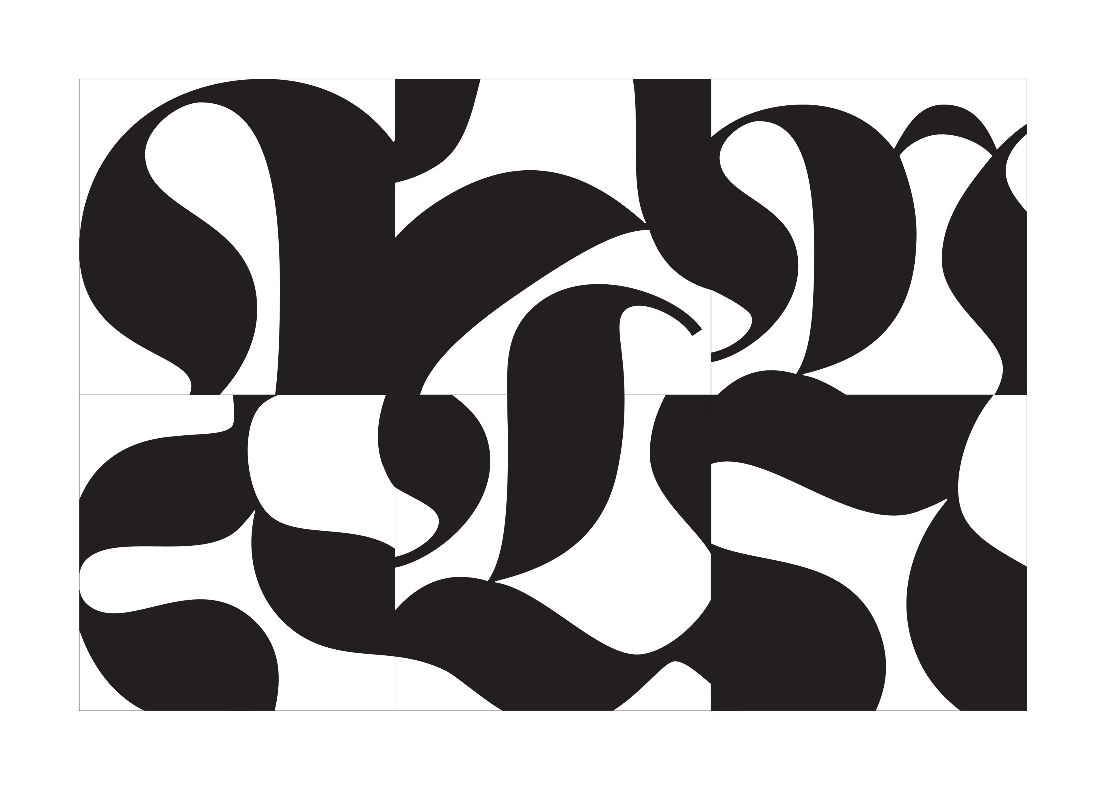
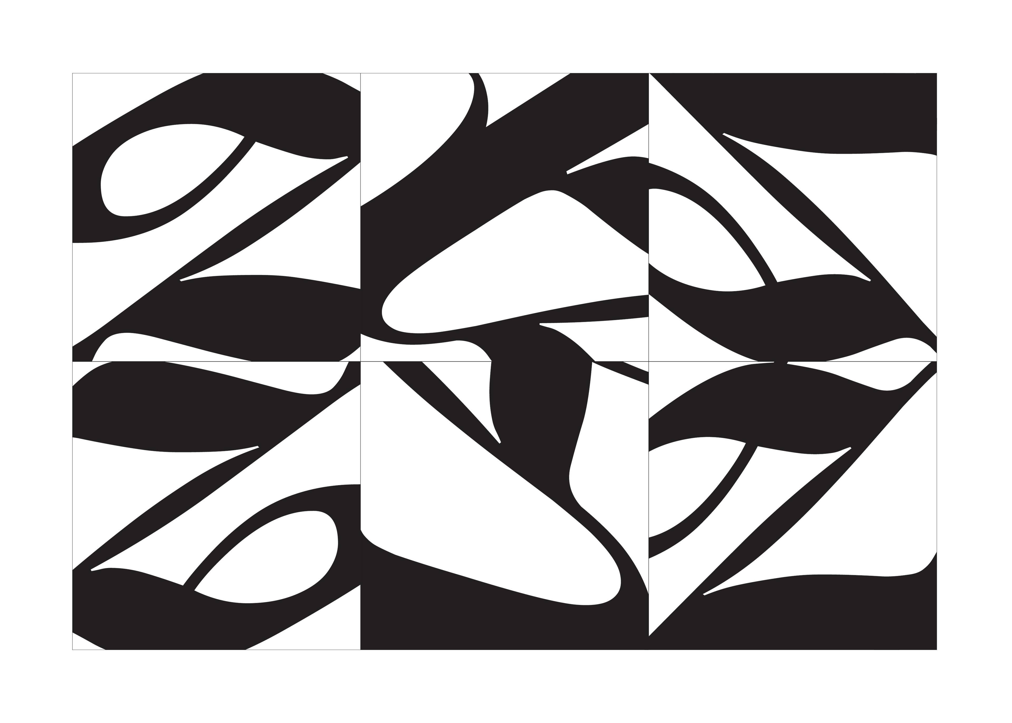
An exploration into the classifications of typography; using type to create abstract celebrations of their unique features. Each composition uses a different typeface, a new character, and a specific classification.
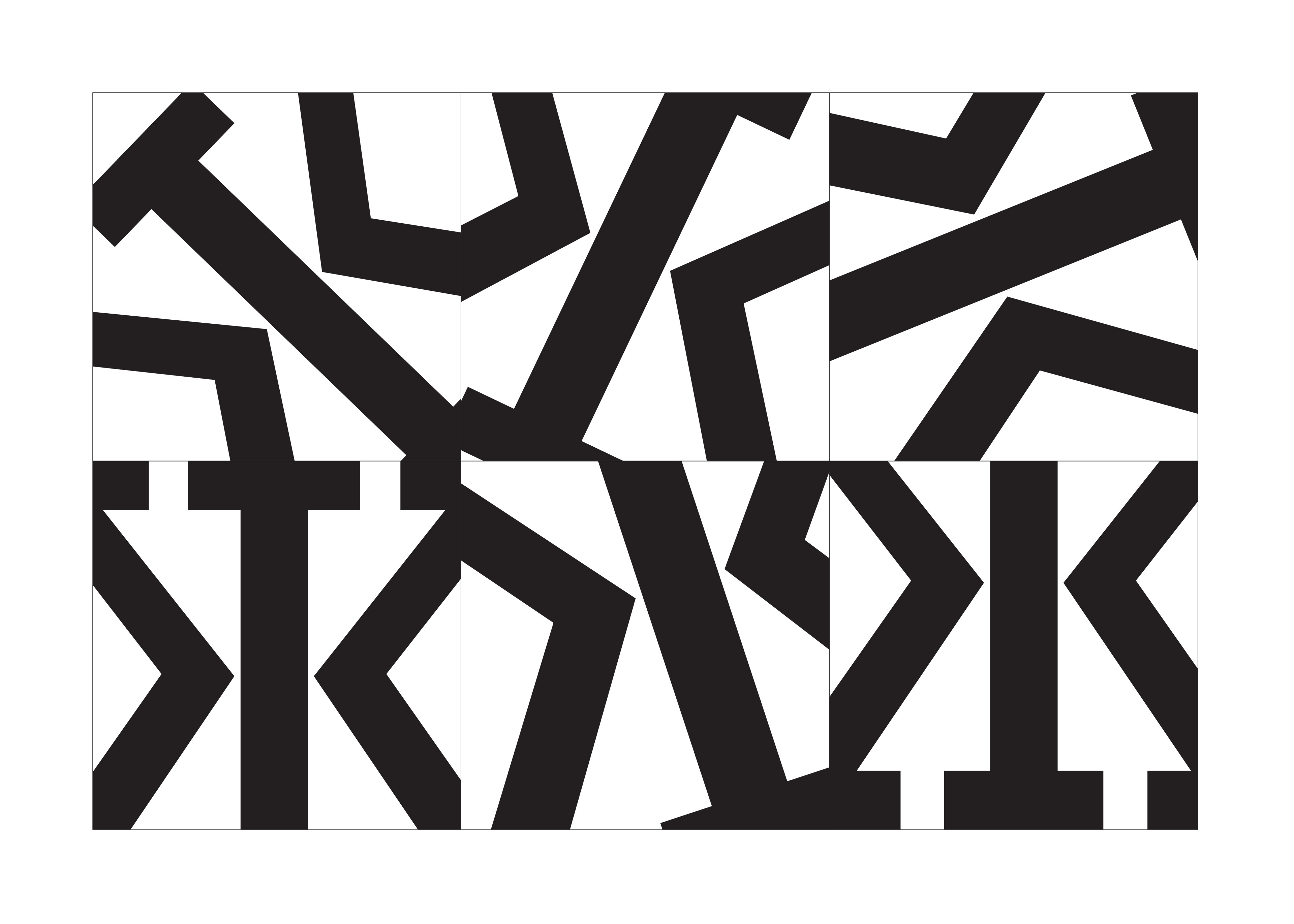
Rockwell. An egyptian, or slab-serifed typeface, characterized by their heavy, blocky serifs and sharp corners and angles.
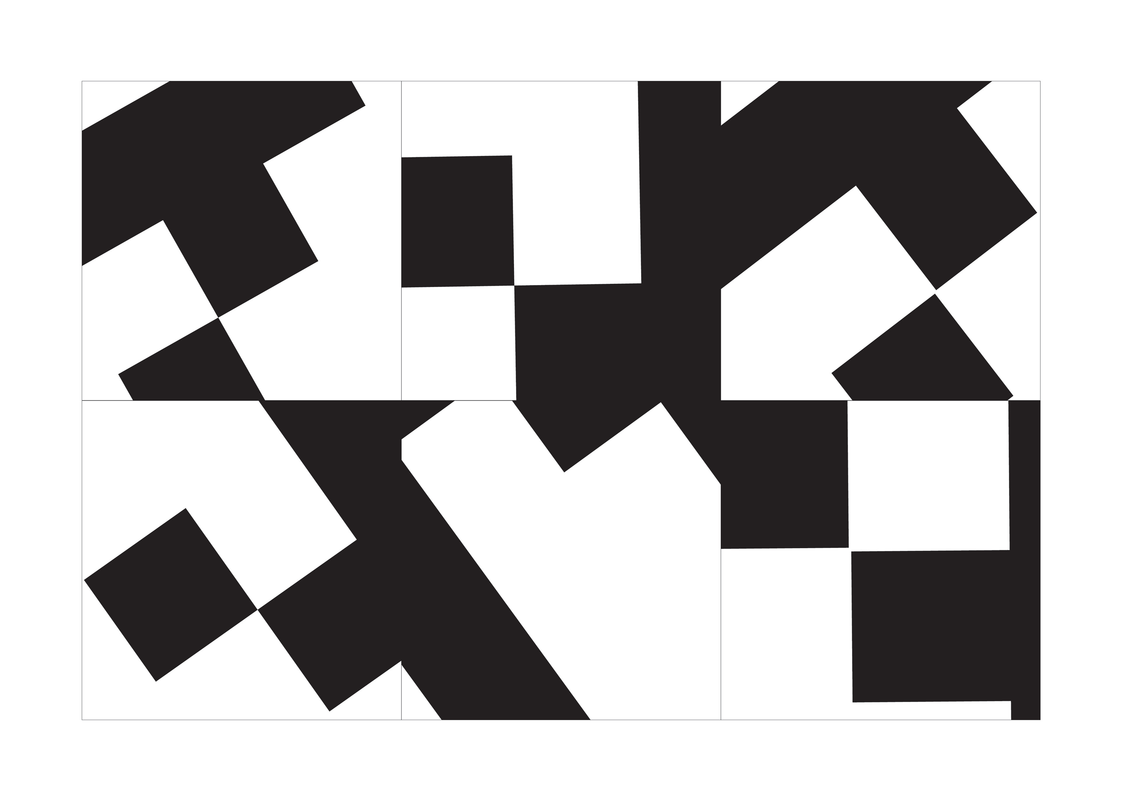
Sevenet. A pixel typeface, which developed from the invention of the computer and were based on an array of pixels that could be displayed on the early computer screens.
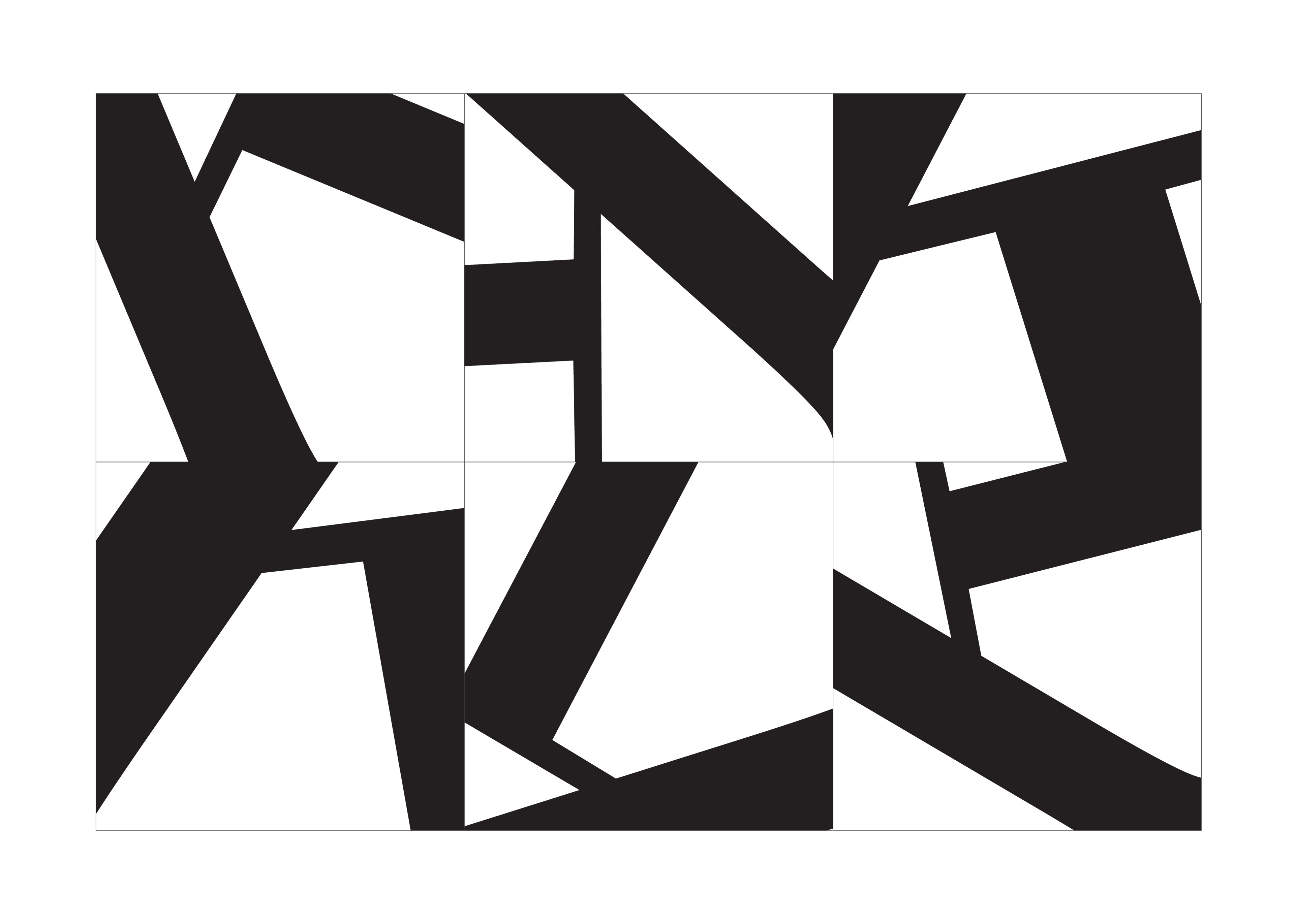
ITC New Baskerville. A transitional serifed typeface, showcasing structural “feet” on many of the letters characterized in general, by a high contrast in stroke weight, and also featuring a more vertical axis and sharper serifs.
Bauer Bodini. A modern serifed typeface, characterized by sharp, thin serifs and high contrast of strokes, often creating an art deco look. This particular font includes elegant ball terminals on some characters.
Fette Fraktur. A calligraphic typeface of the blackletter specification. Blackletter characterized by broken strokes and extreme contrast in line weight throughout the letters.
Snell Roundhand. A script typeface, of the serifed classification, is based on forms made with a flexible brush or pen and often have varied thick & thin strokes reminiscent of handwriting and creating a very fluid effect. The letterforms have long curvy looped serifs and ball terminals.