With a classic Rice Krispies cereal box as the subject, this work was born from the idea of using typography to design the box around a specific attribute. Each of the 3 design concepts features a different thematic element; energy, sophistication & interdependence. I explored a variety of iterations during my process, which you can peek at here.
Concept: Energy
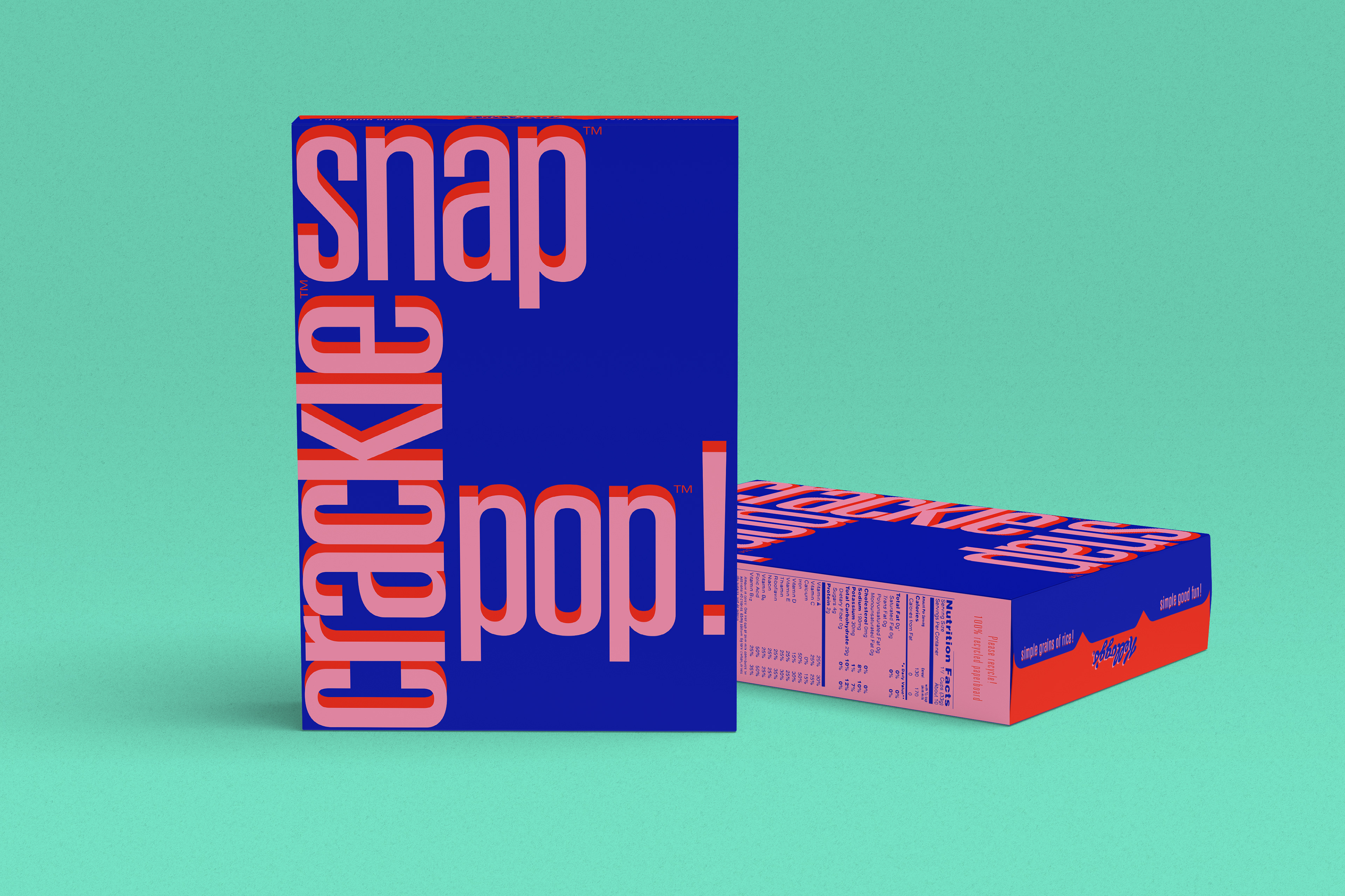
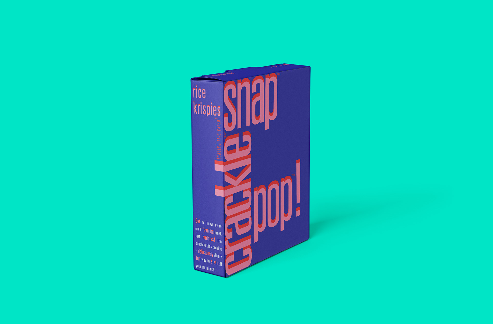


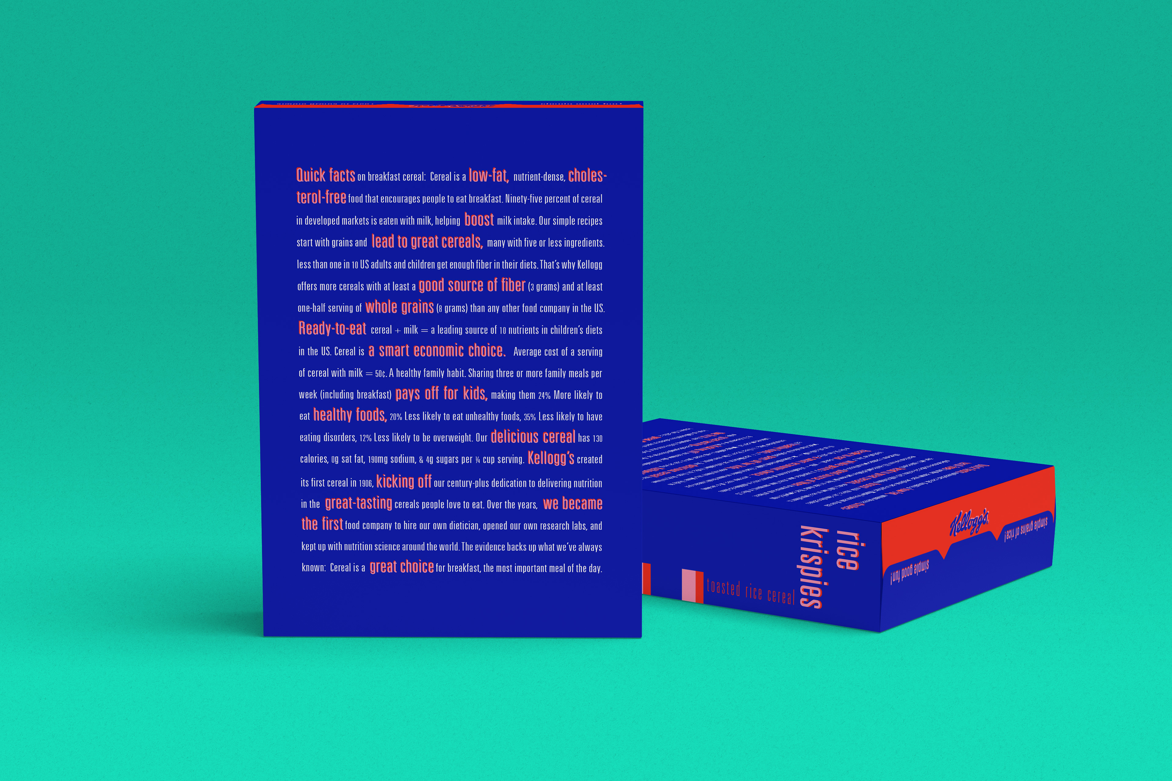
Using the idea of energy as the theme for this version, I wanted to let the "Snap-Crackle-Pop" take center stage. I chose to activate those words using a bold, vibrating color palette and oversized type. I selected specific words from the large body of copy that seemed either energizing or positive in nature and emphasized them using scale, color and stacking to suggest the type is almost jumping out.
Concept: Sophistication

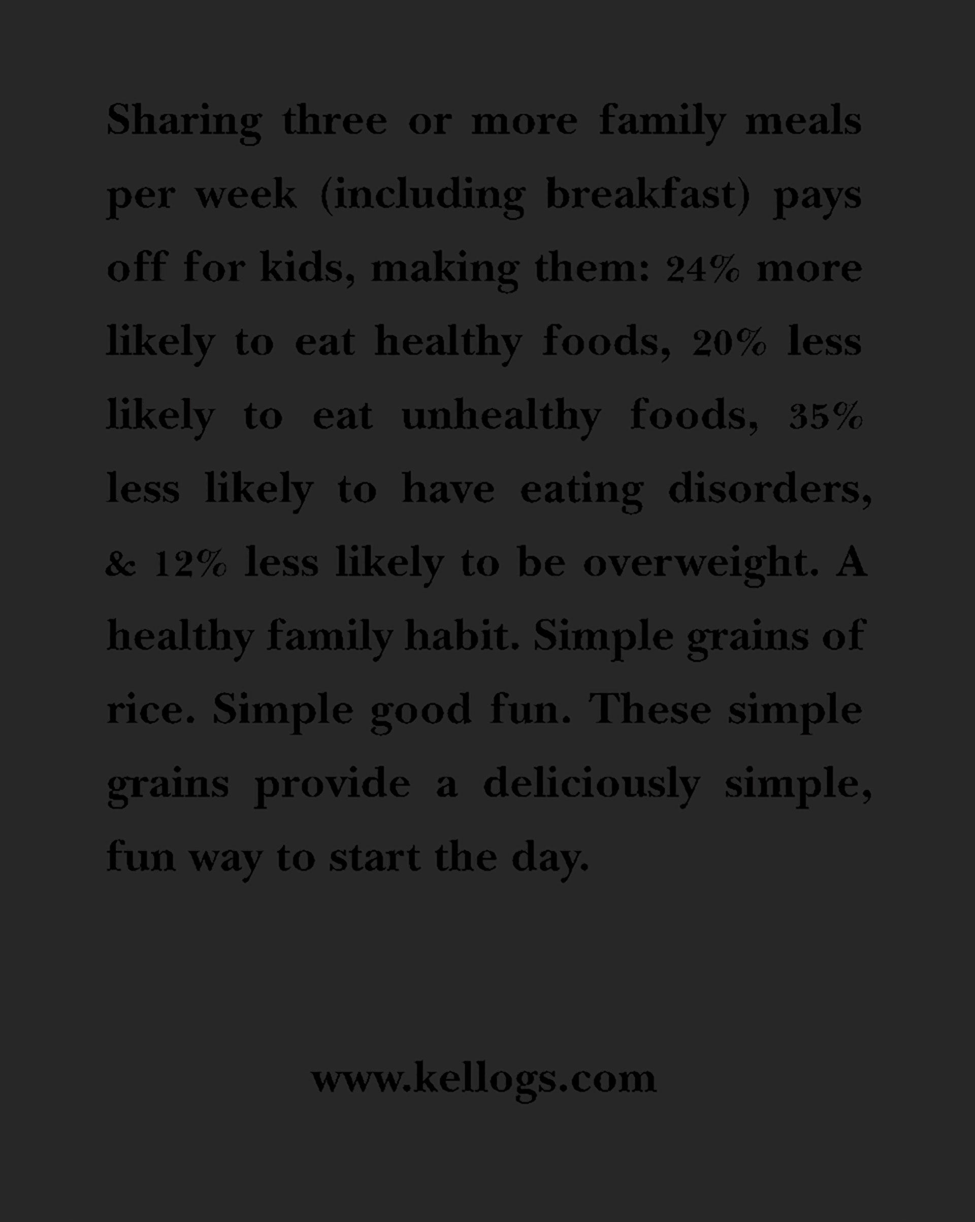
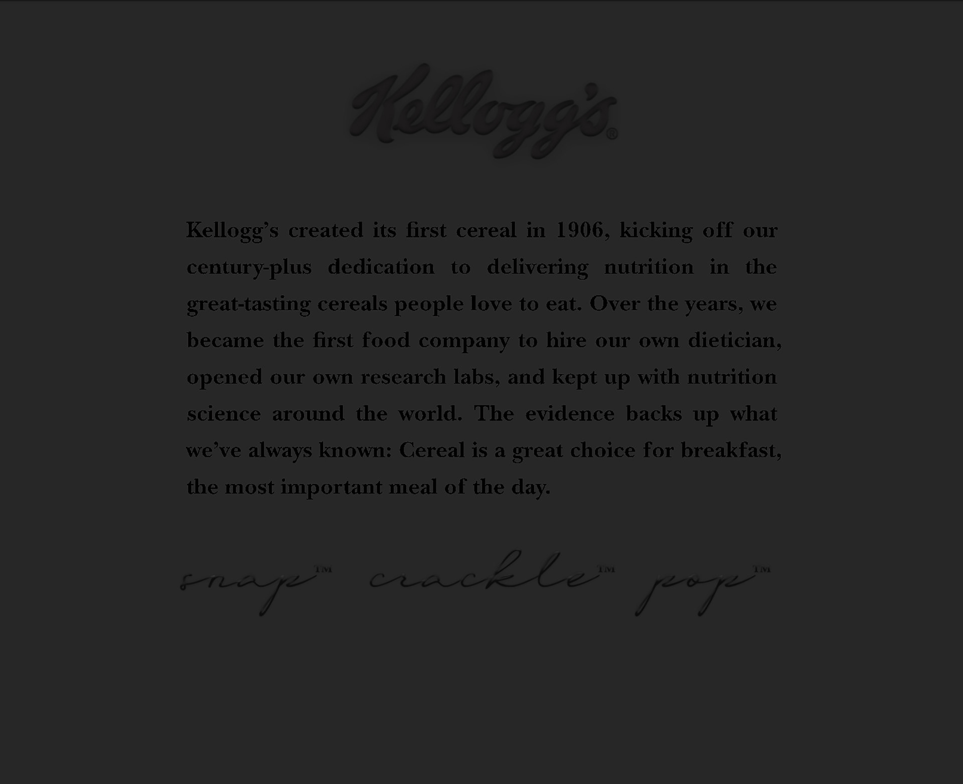
Through a lens of sophistication, I wanted to create a cereal box that looked like it was a designer cereal for a high-end boutique-- a quip on the concept of low-end meets high-end. I wanted this box to look sleek, edgy & luxurious. Using fashion design "black label" collections as my inspiration, I used a matte black ground and embellished the type to have a glossy black, raised finish from the box's surface. I paired the modern serif typeface, Didot (along with New Baskerville bold for legibility on the small copy) with a handwriting-script style typeface to add some tension & emphasis between the copy elements. I referenced fashion labeling with center-back placement for the brand logo. The script type elements are also a nod to designer signatures that often appear within high fashion luxury labels.
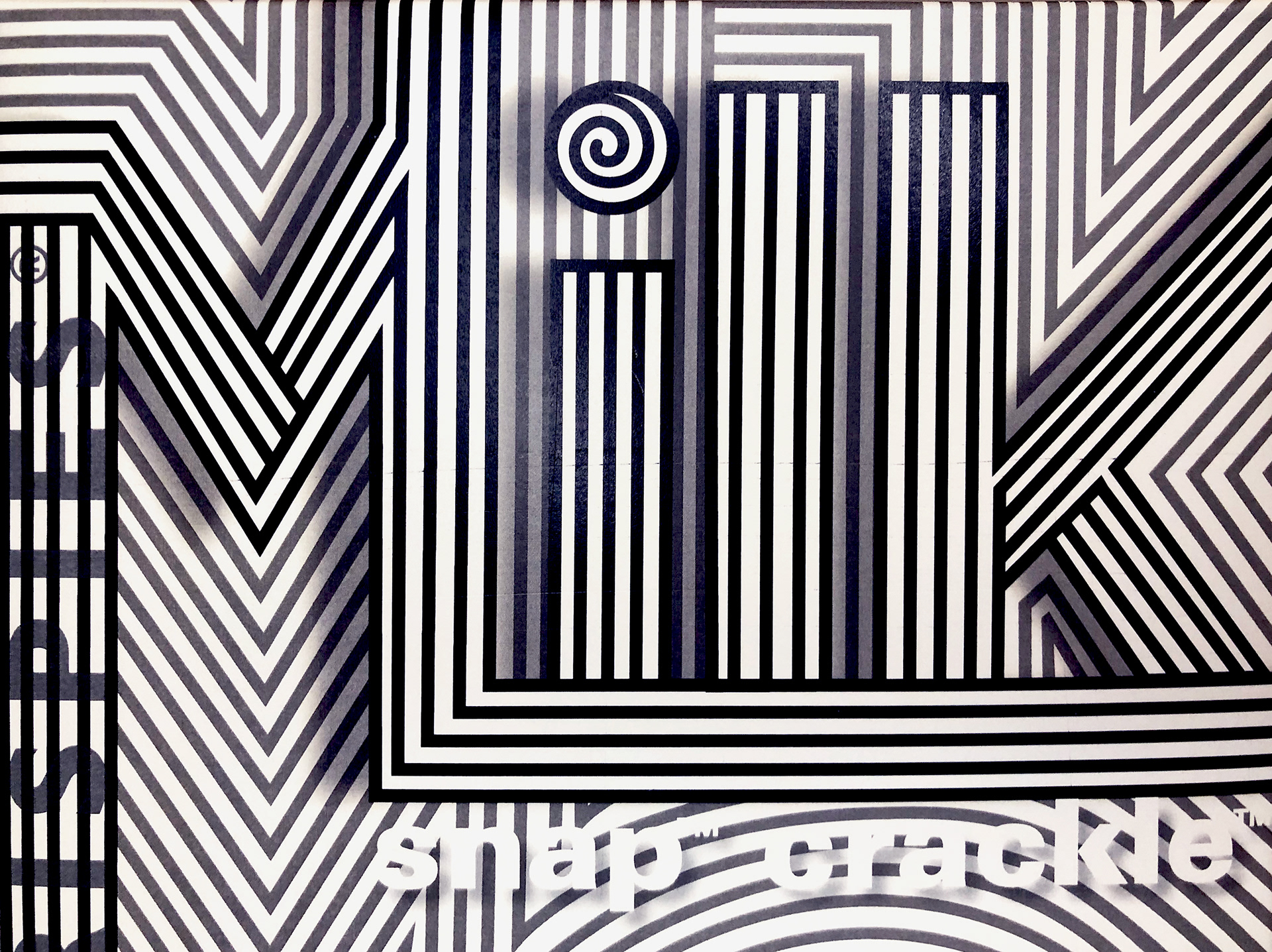
Concept: Interdependence
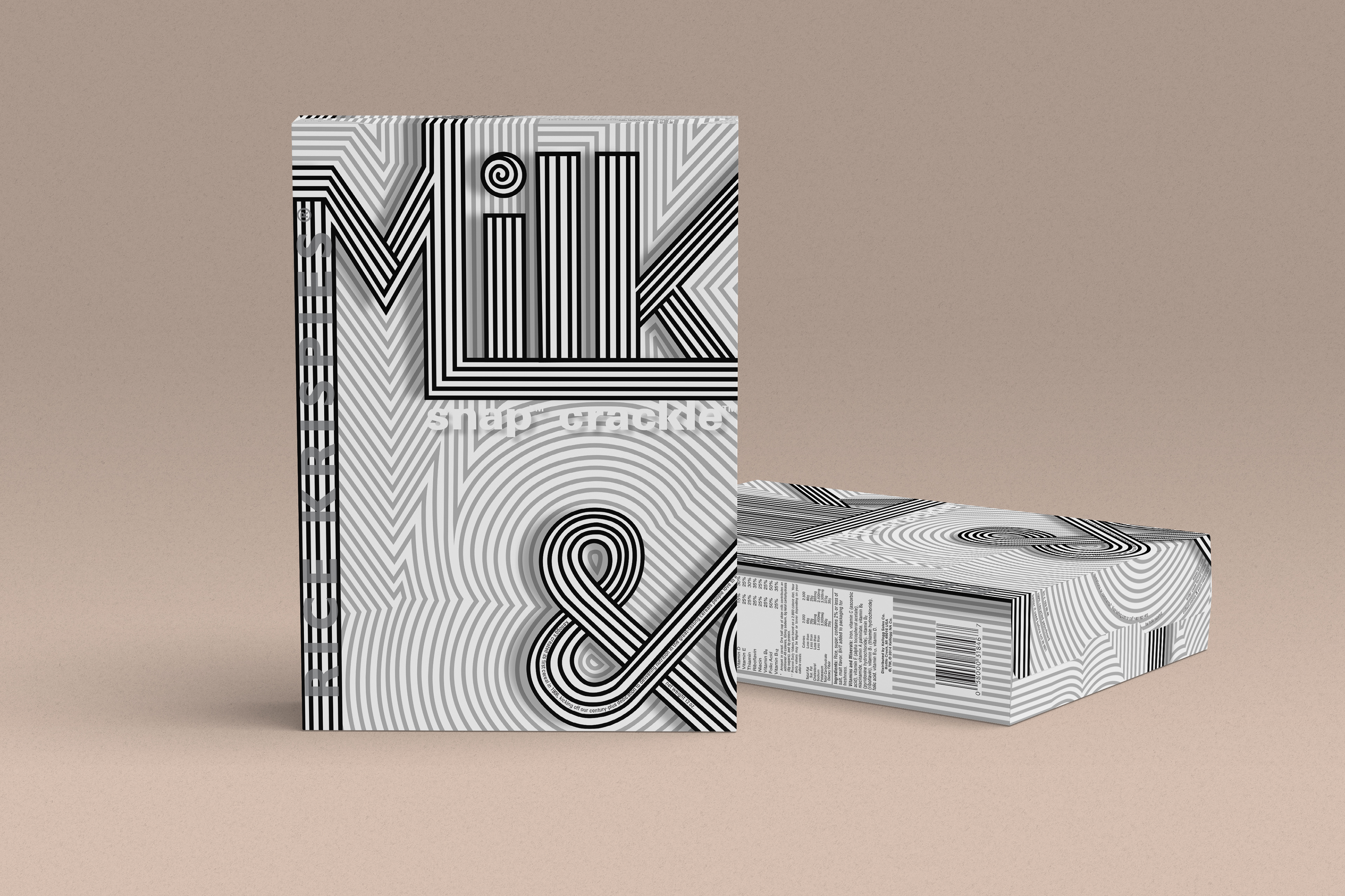
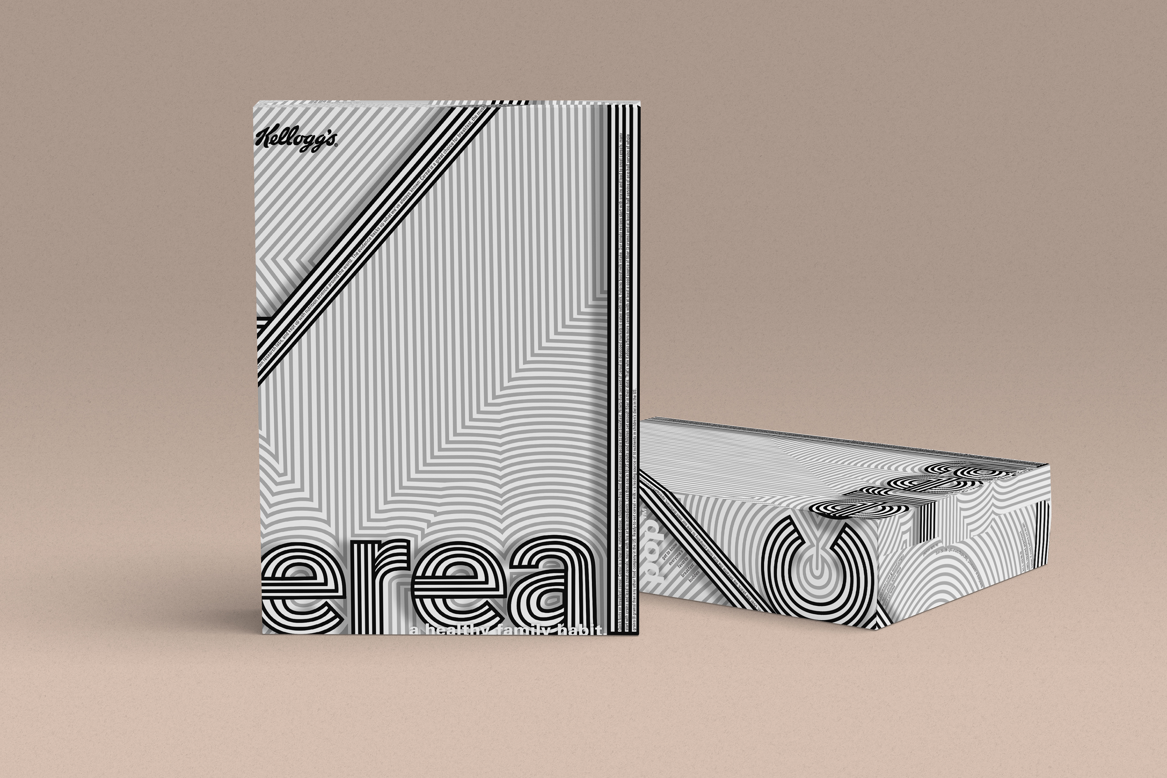
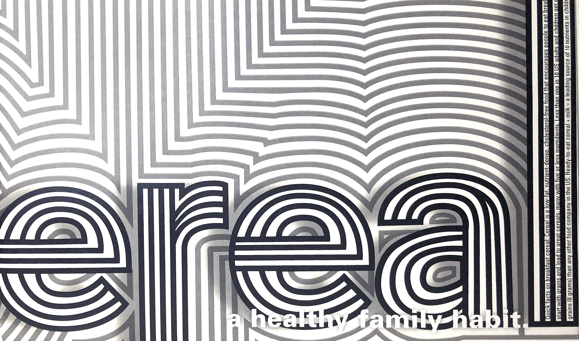
For this more abstract theme, I chose to play off of the idea of the interdependence between milk & cereal on this box design. The design approach itself started with a hand-generated doodle of sorts, where I started with blocky letters and then began outlining them with similar strokes to create an camouflaged environment where the words and background were interdependent on each other. I took it a step further by using a black, white & gray palette which have their own interdependence on each other. To incorporate the cereal box's copy in a way that accentuated the concept, I placed the majority of the text within the white line space, making it an active part of the linear design. The result is harmonious, interactive, and full of little surprises.
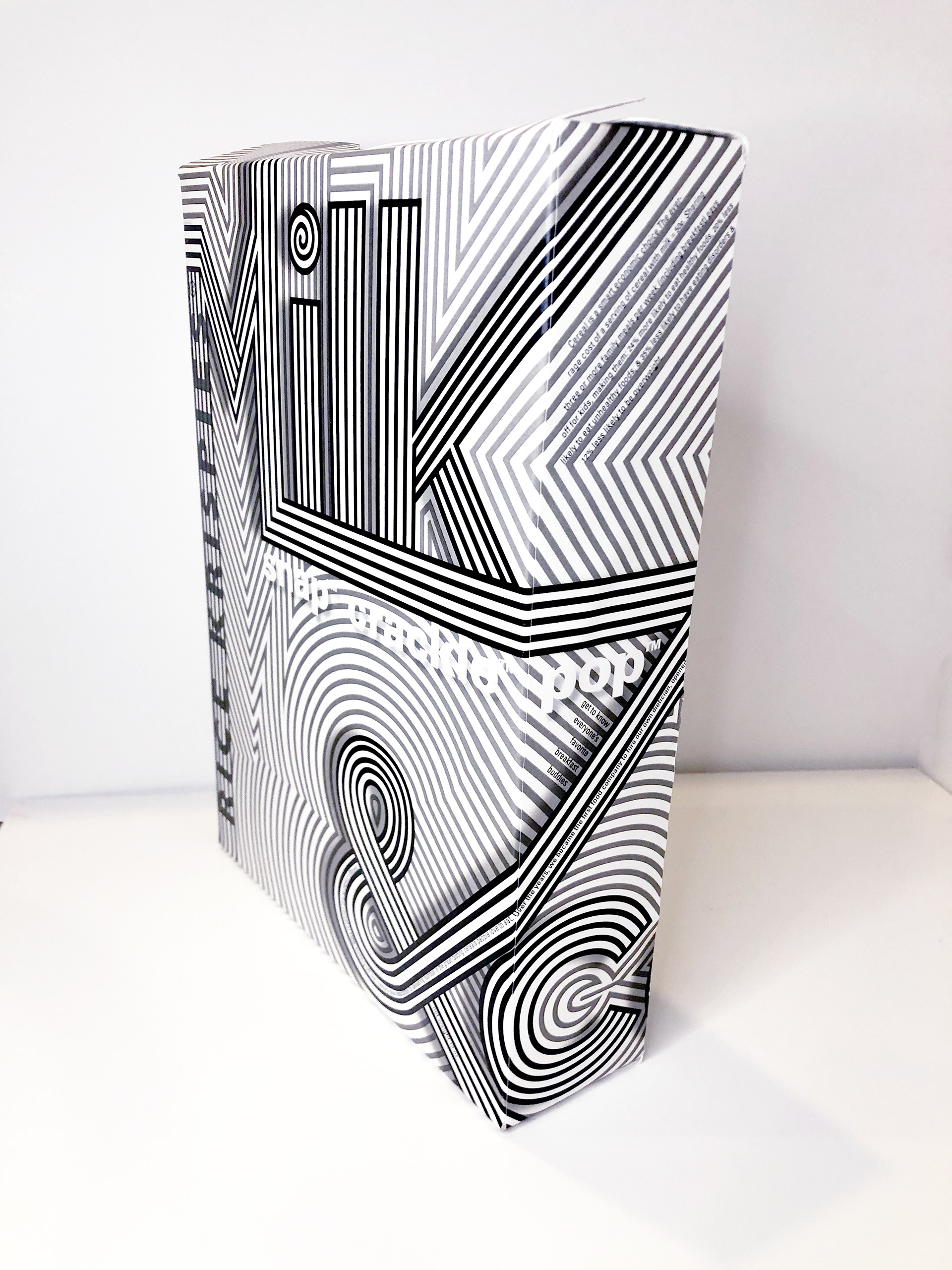
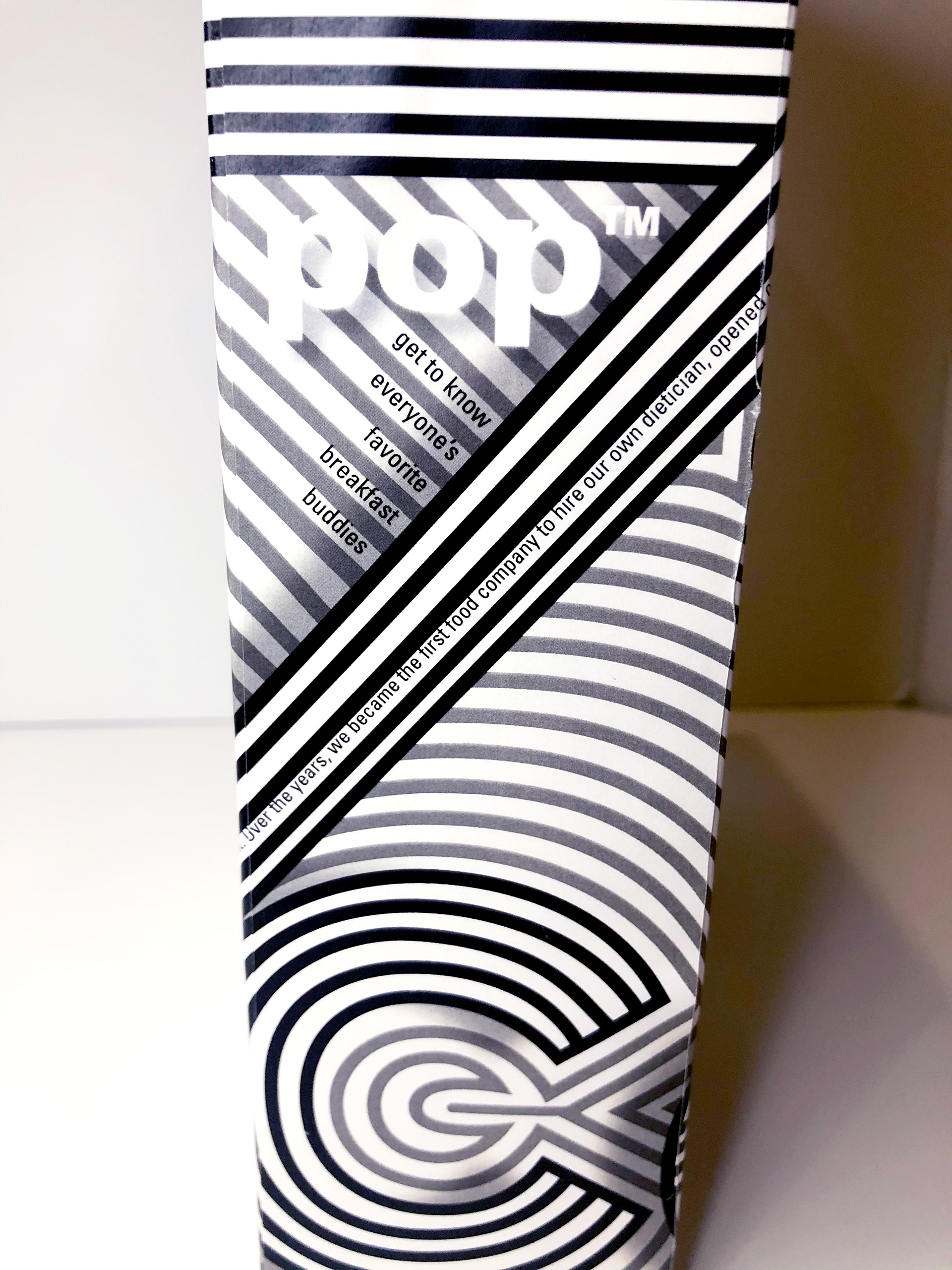
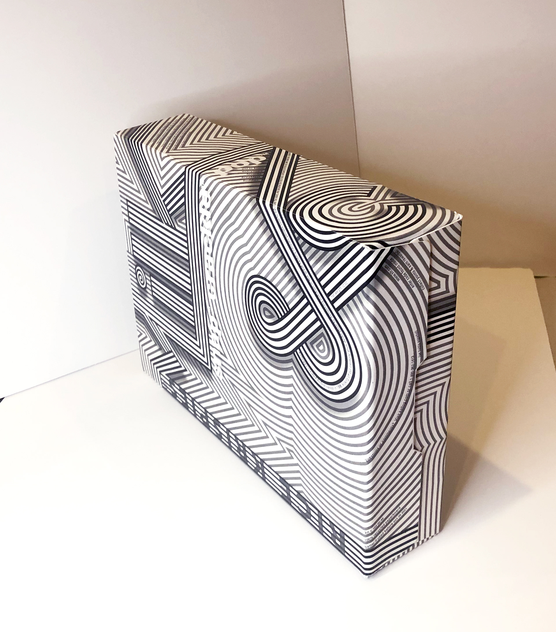

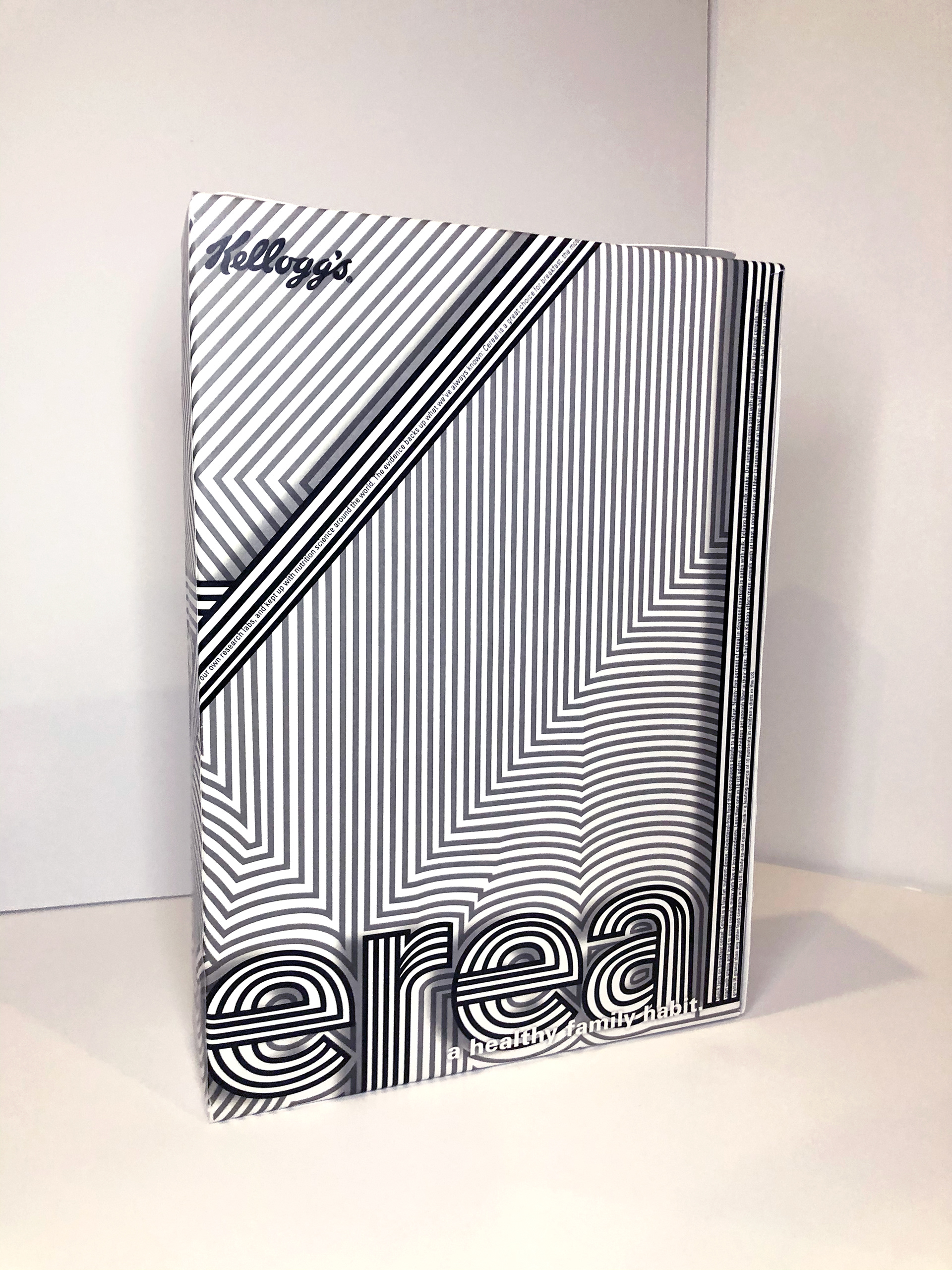
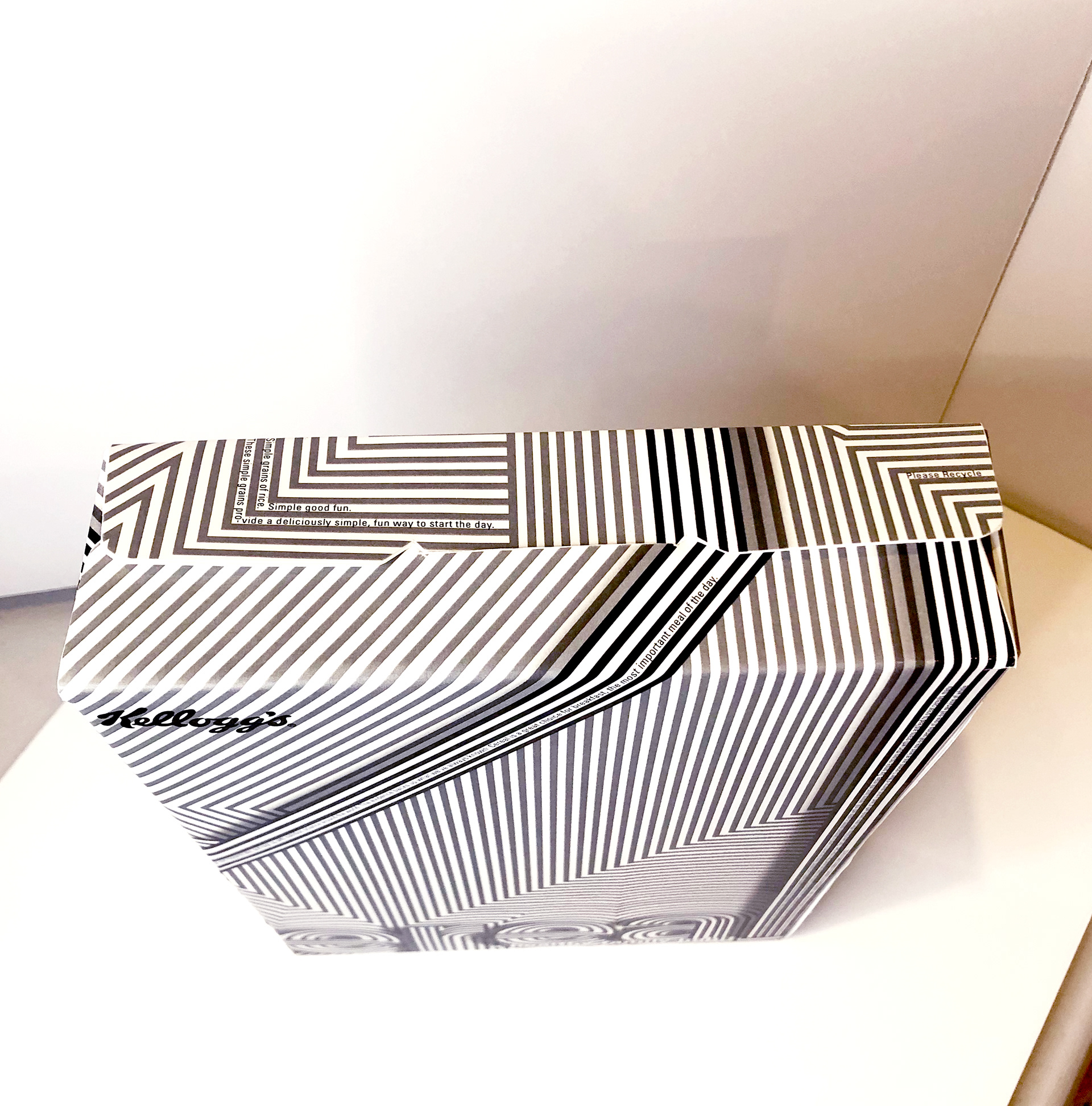
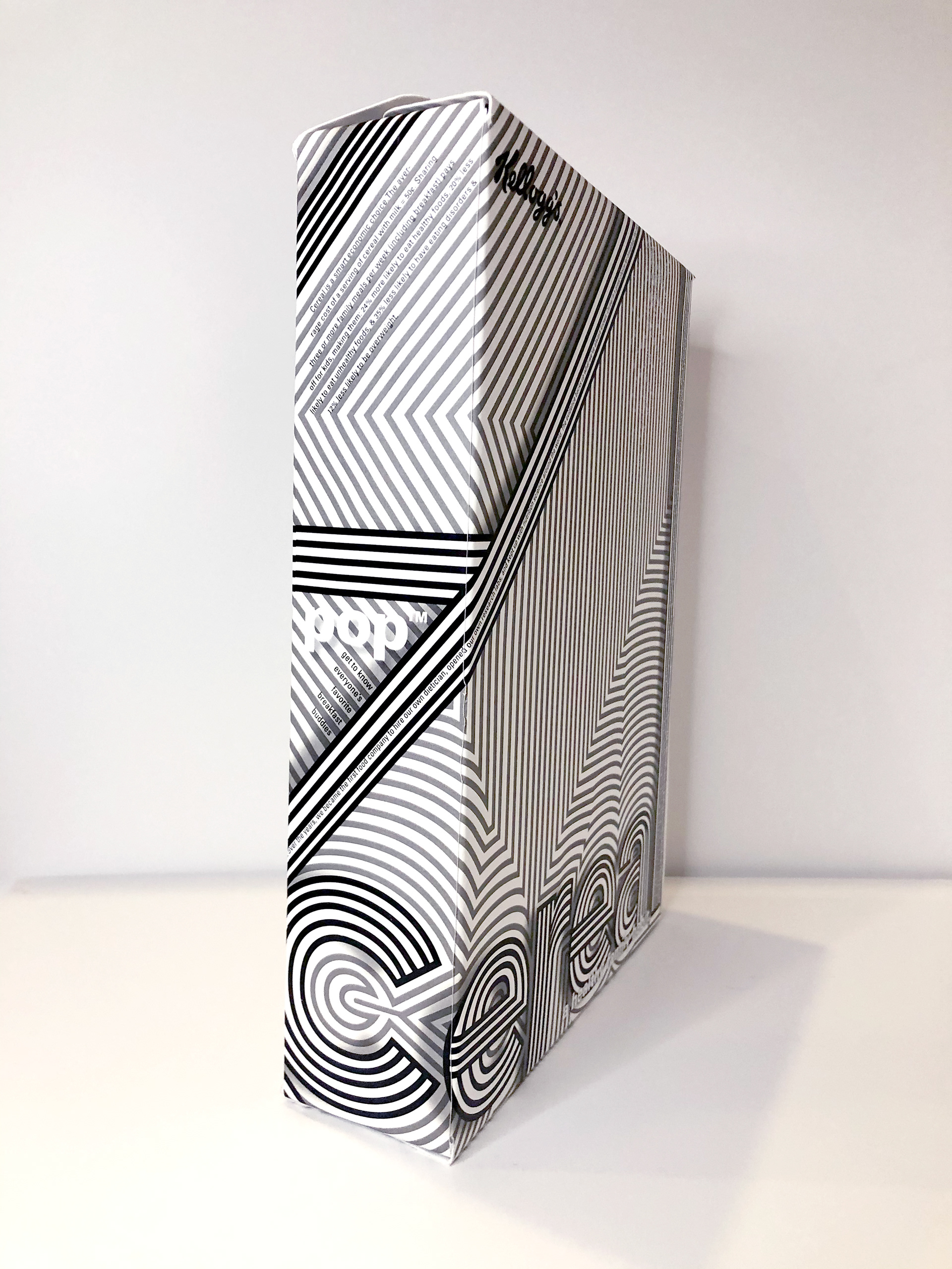
I constructed a physical box from bristol board to showcase this concept. When the design took its 3D form, it became even more animated and involved. As the linework wraps around the box, the type elements simultaneously pop out from the background while also blending in, striking wonderment as your eye explores all of the different surfaces.
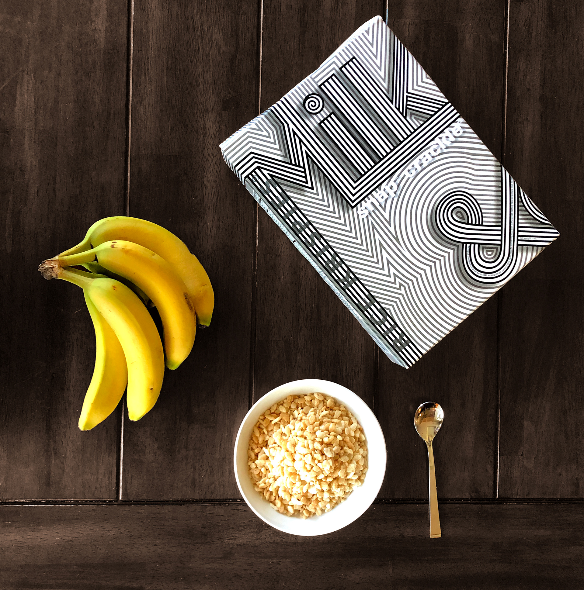
The box within its environment - at the breakfast table.