a non-profit brochure design
This double-gate-fold brochure was designed as part of an activist campaign leading up to the 2020 election.
Process Work
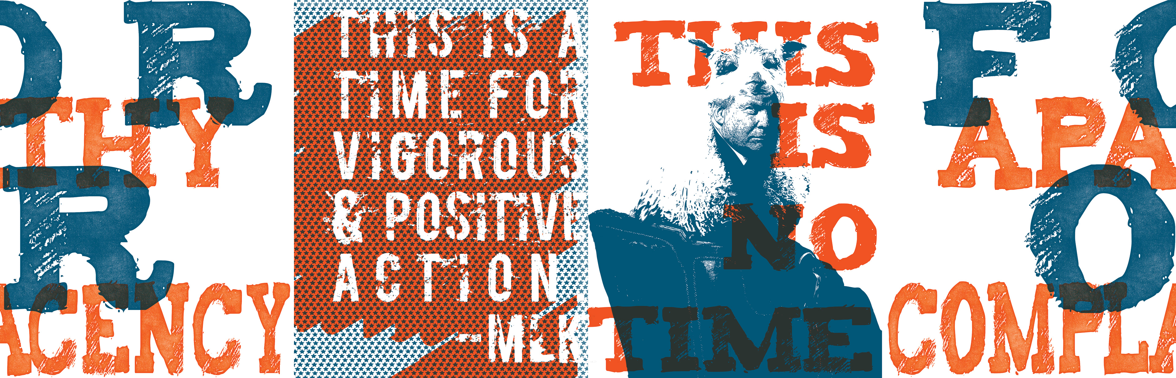
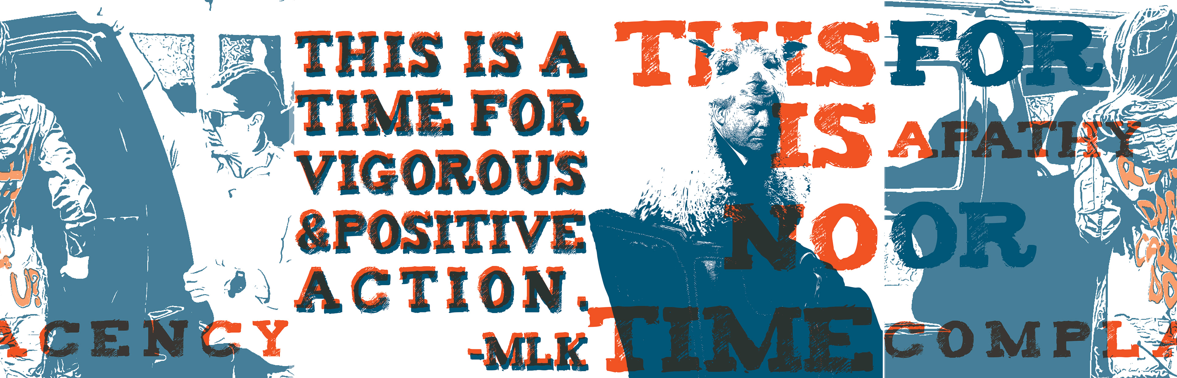
These above iterations show how I explored using monotone and vectorized photo images with different type treatments before I arrived at the final doodle-based concept. I also considered a red-blue-purple based color palette at one point, as a nod to the political origin of trumpism’s infiltration on our society. However, through the process, I decided that I preferred the non-political palette of orange and teal instead. I liked how an orange color had an urgency to it- in a caution-like warning sense. And then I wanted to have a severe contrast to the orange, so I chose this oceany-teal color, which has both a literal and metaphorical contrast of cooling waters to the fiery sins.
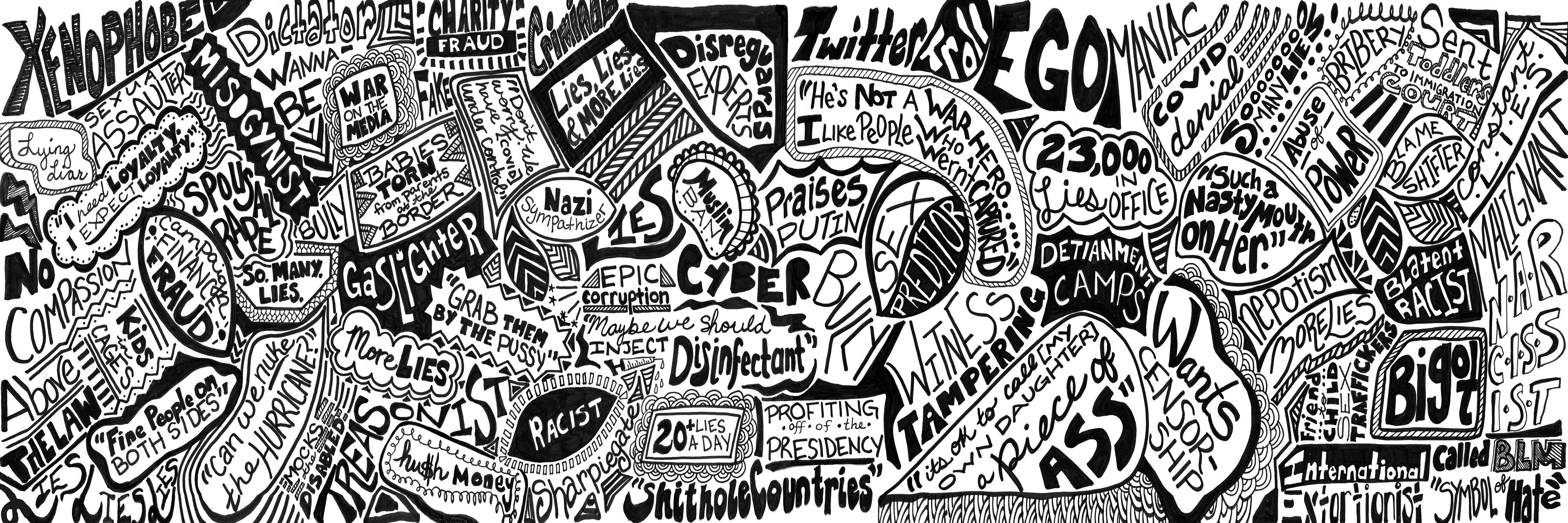
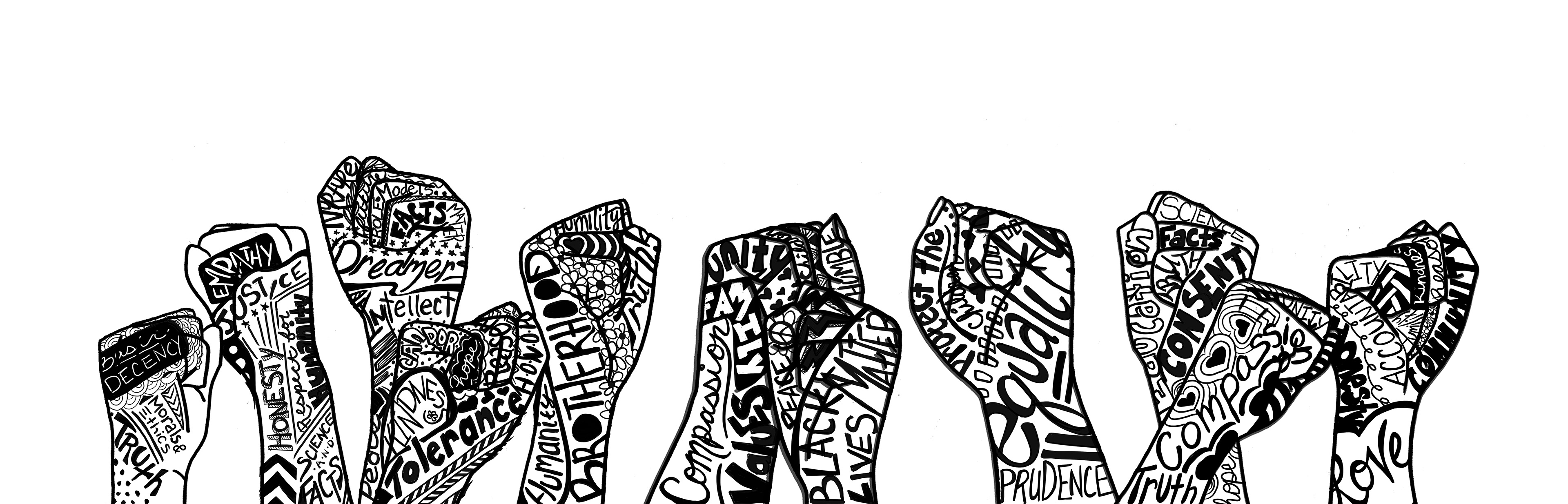
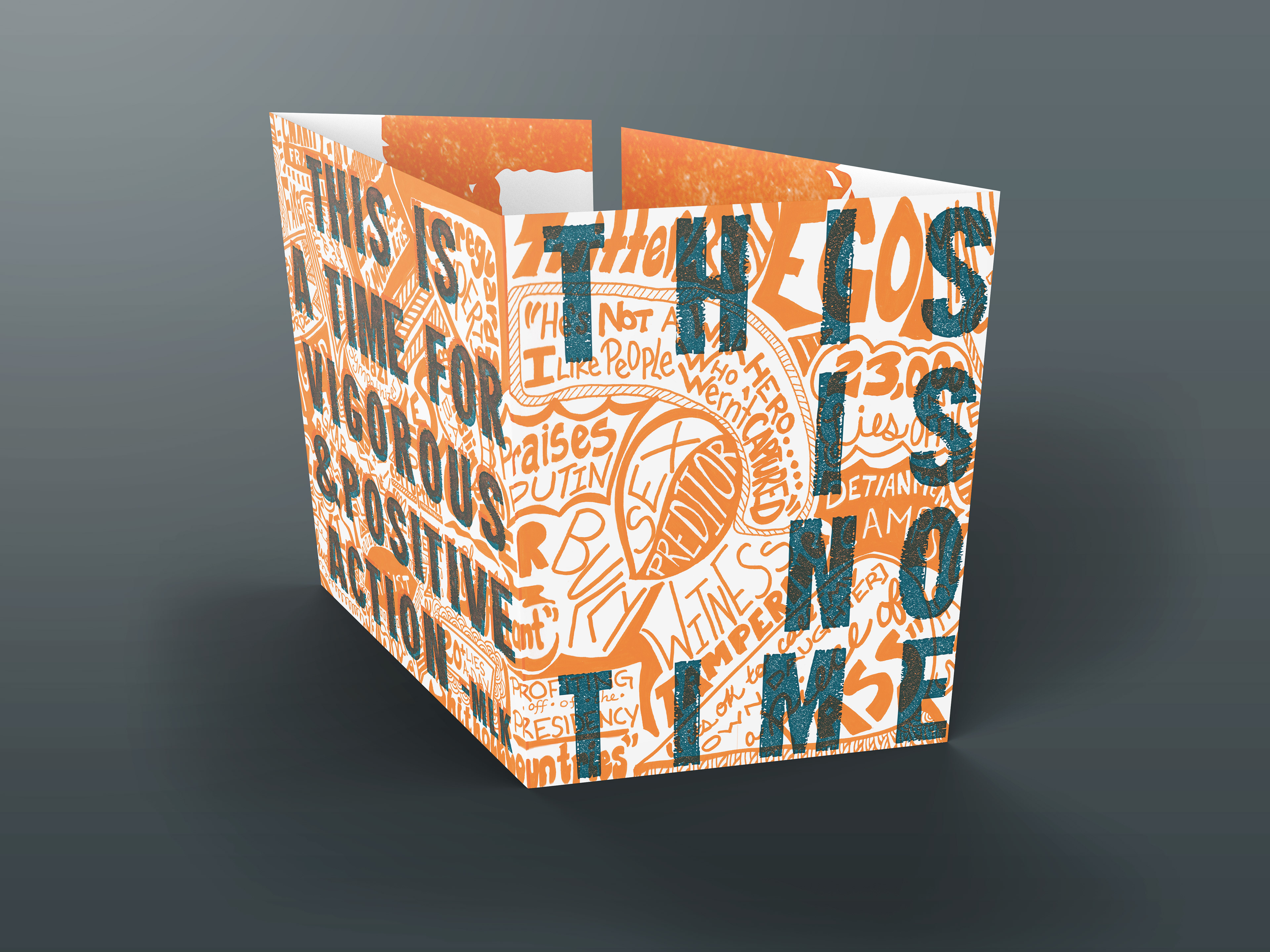
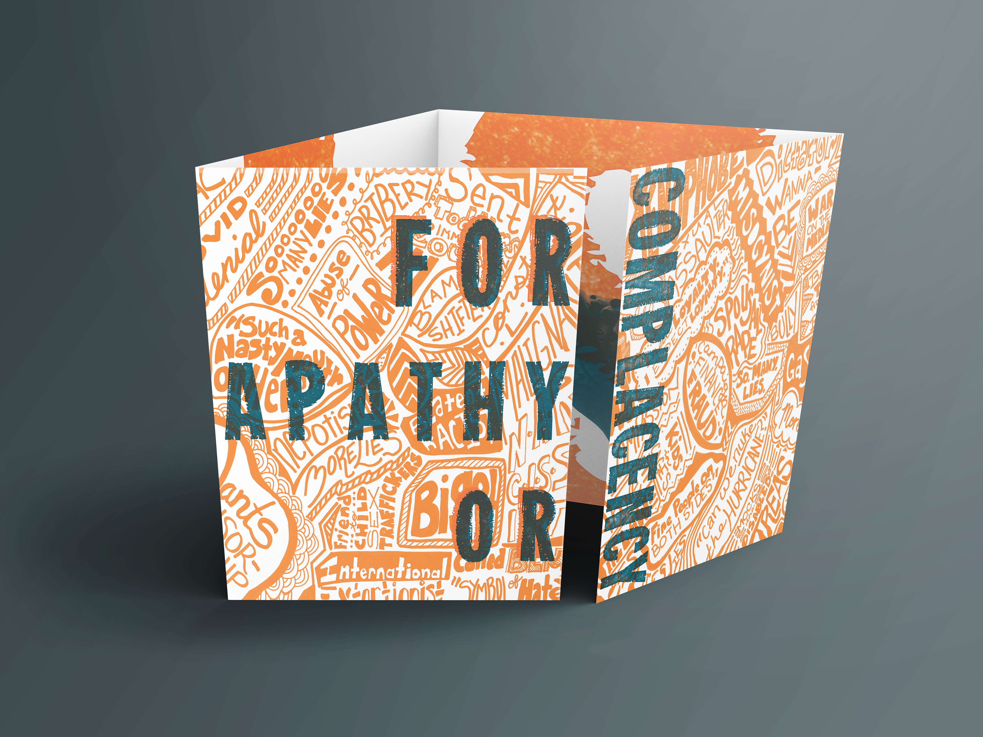
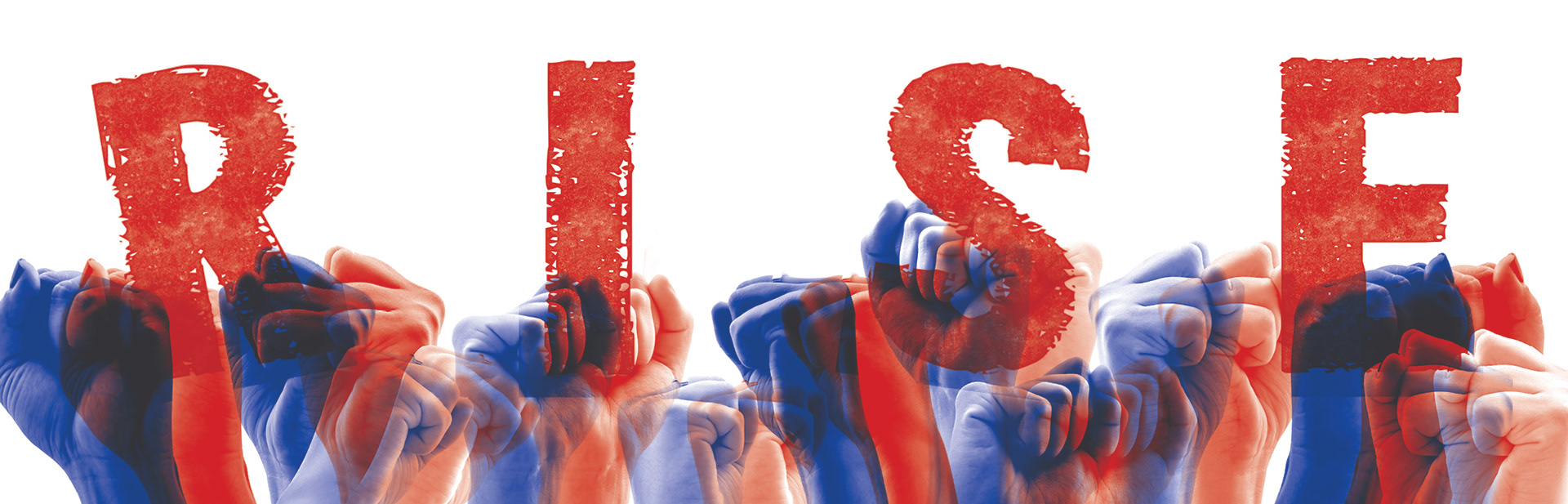
These working spreads above show the hand-drawn doodles used for the final design. The image on top is the doodle used on the outside of the brochure. I was going for a wall-of-graffiti look, and I used ink on paper to create the image. For the second doodle, I also drew this by hand with ink, but the doodles were meant to appear as tattoos on top of fists raised in protest. The words used are the antidote to the horrible truths represented in the graffiti wall on the opposing doodle.
Final Design
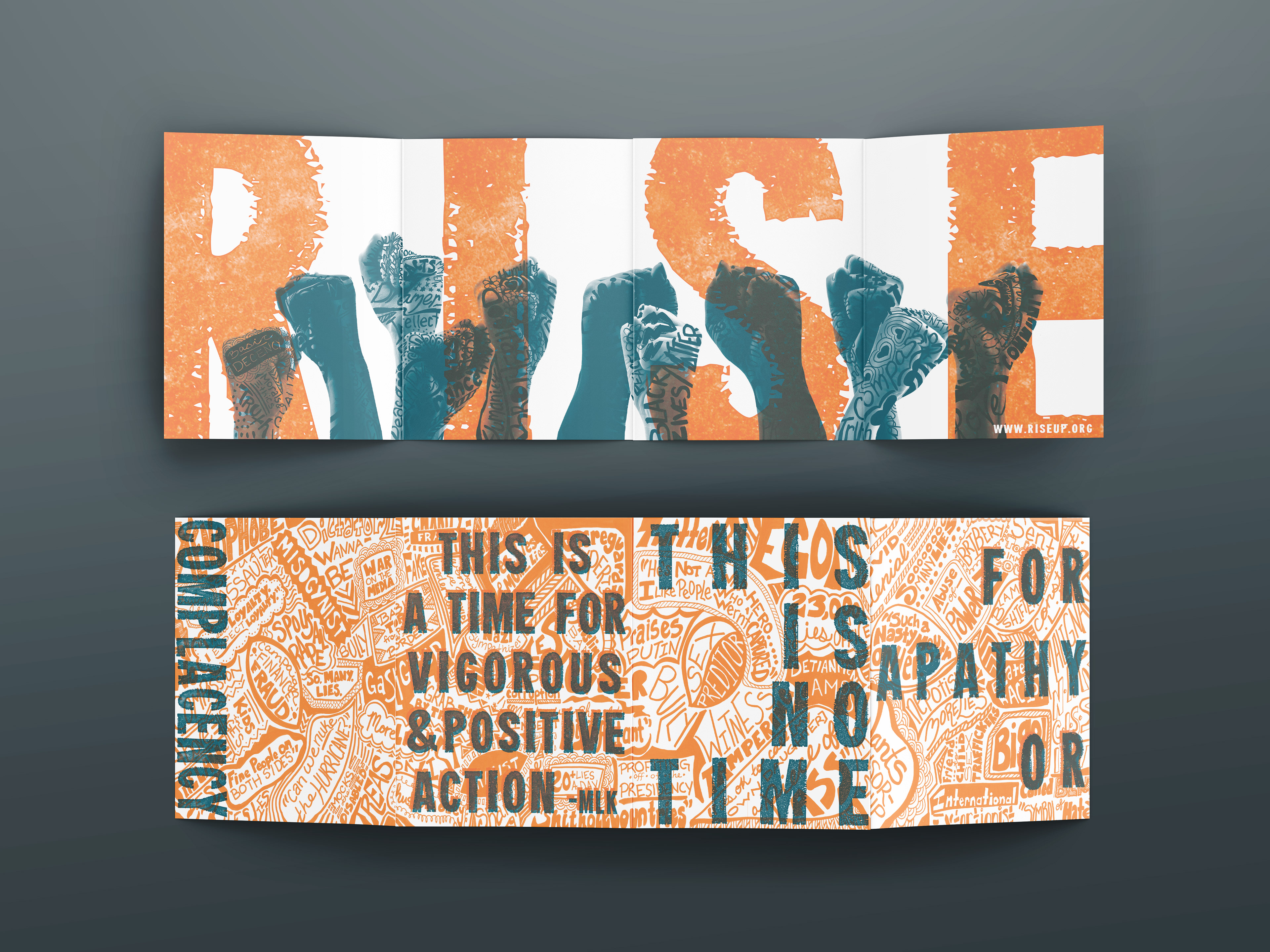
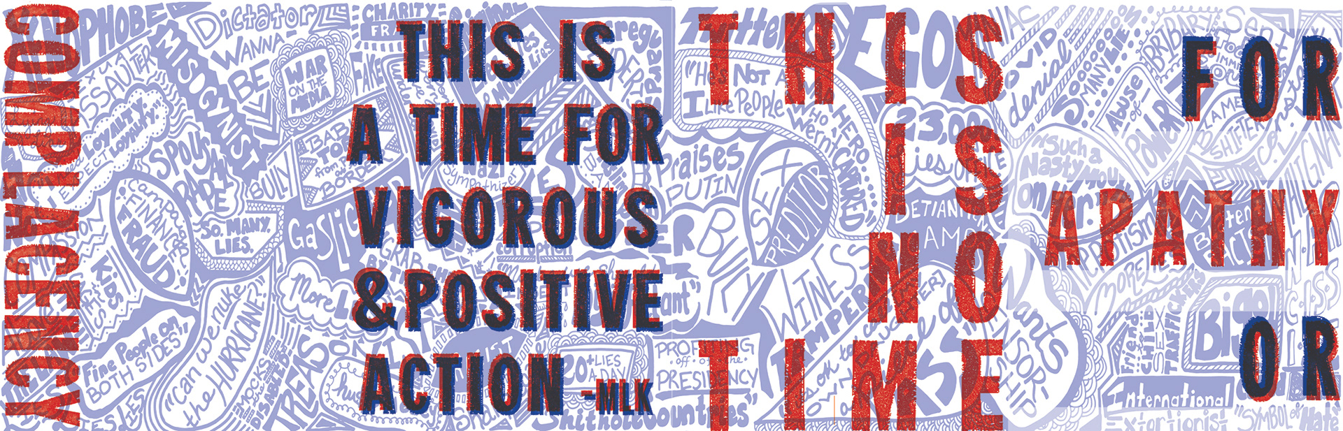
above: The brochure spreads shown opened. (top) inside, (bottom) outside. The design was printed as an overprint, using 2 colors on white.
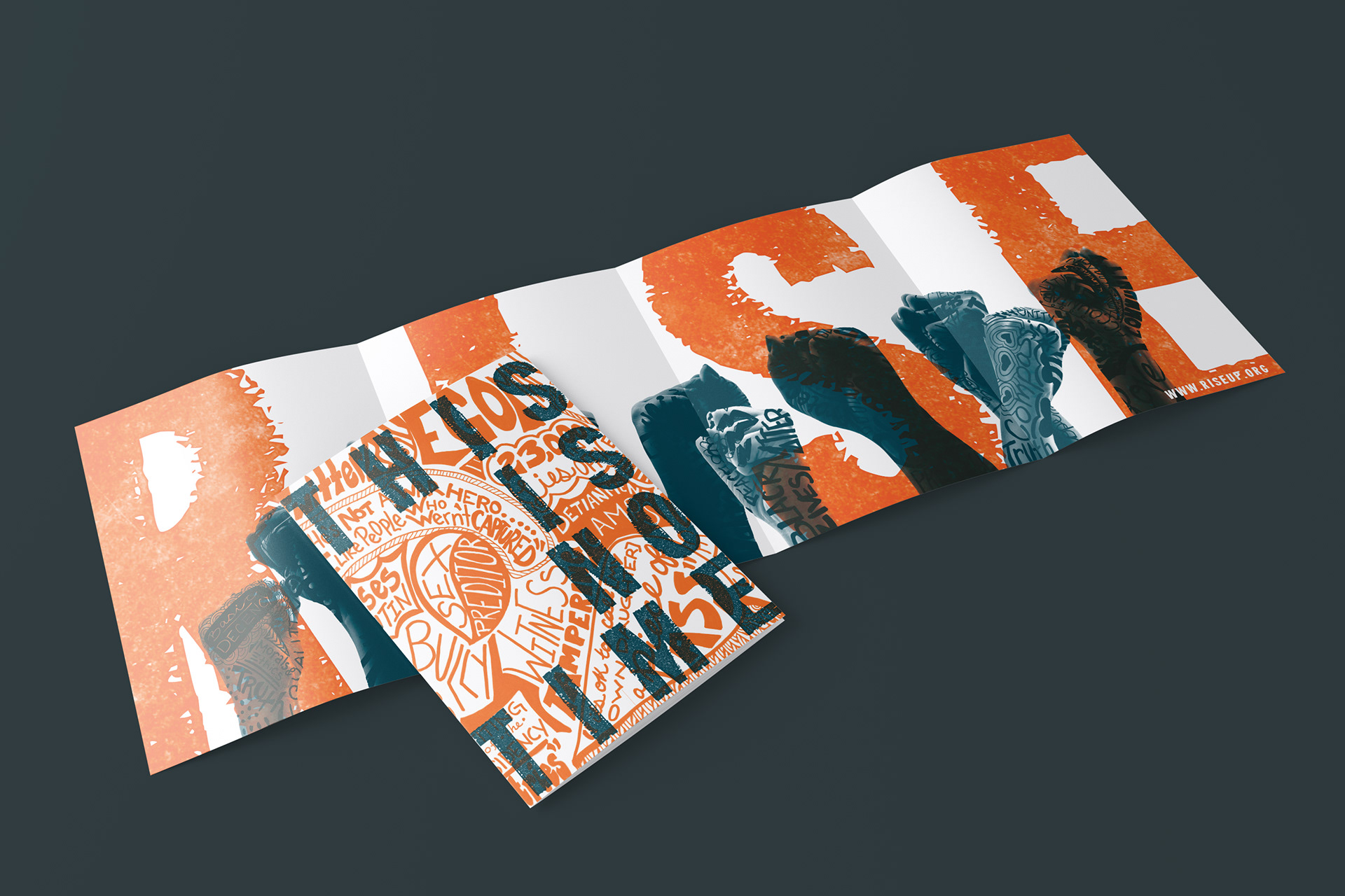
above: The full inside spread shown open with the cover view shown laid on top.
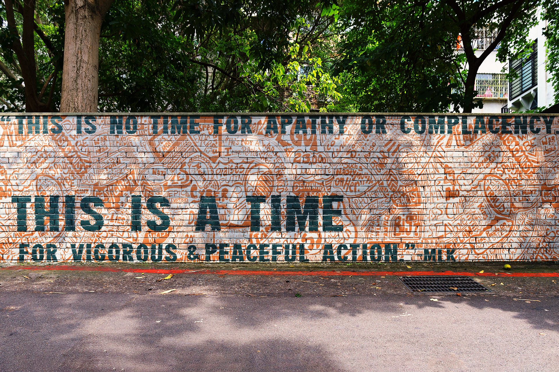
The graffiti doodle design shown in an environmental context.