Butterfly Pea Flower Tea
A branding project, focused on logo development, illustration, and packaging surface designs.
Logo Process Work
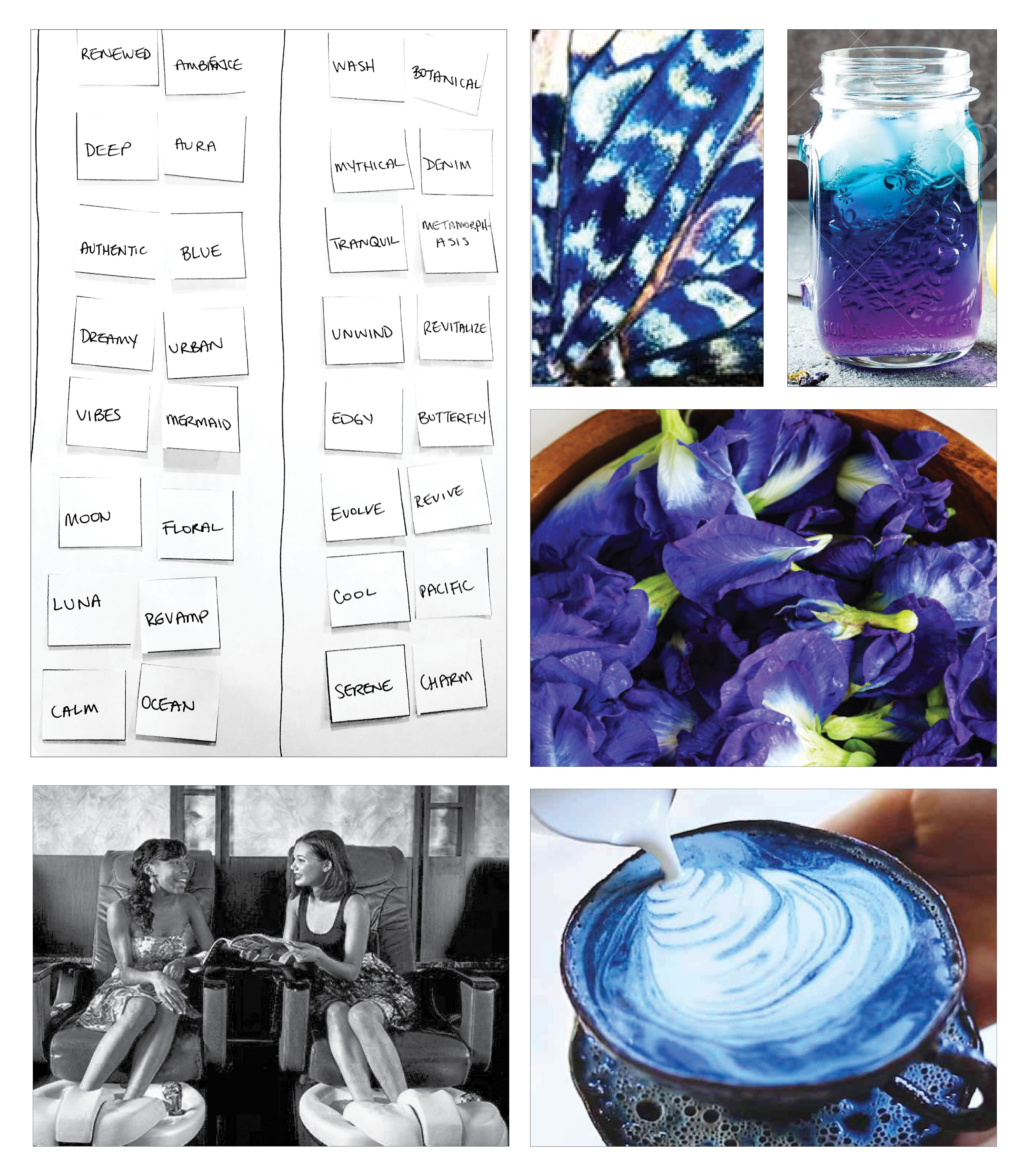
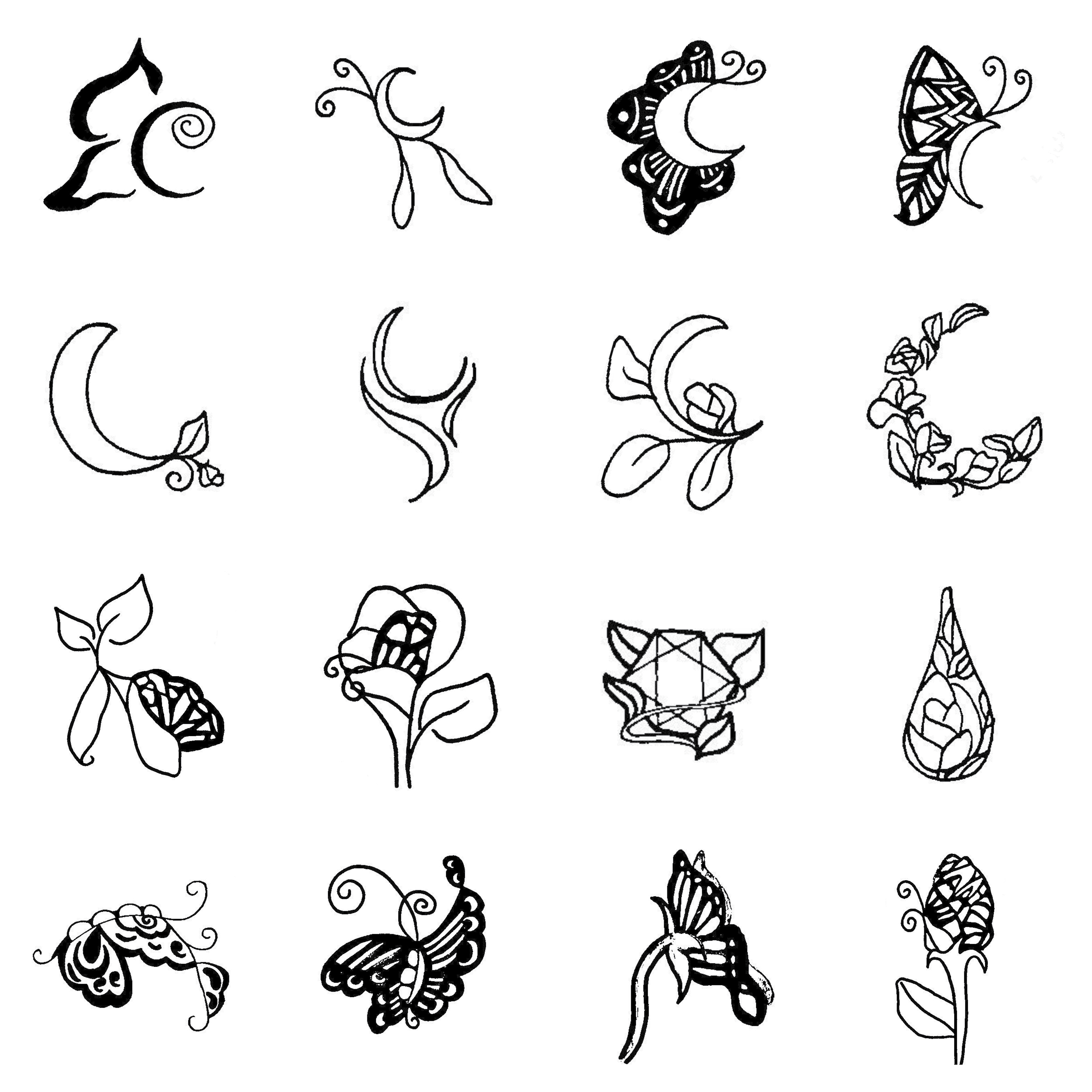
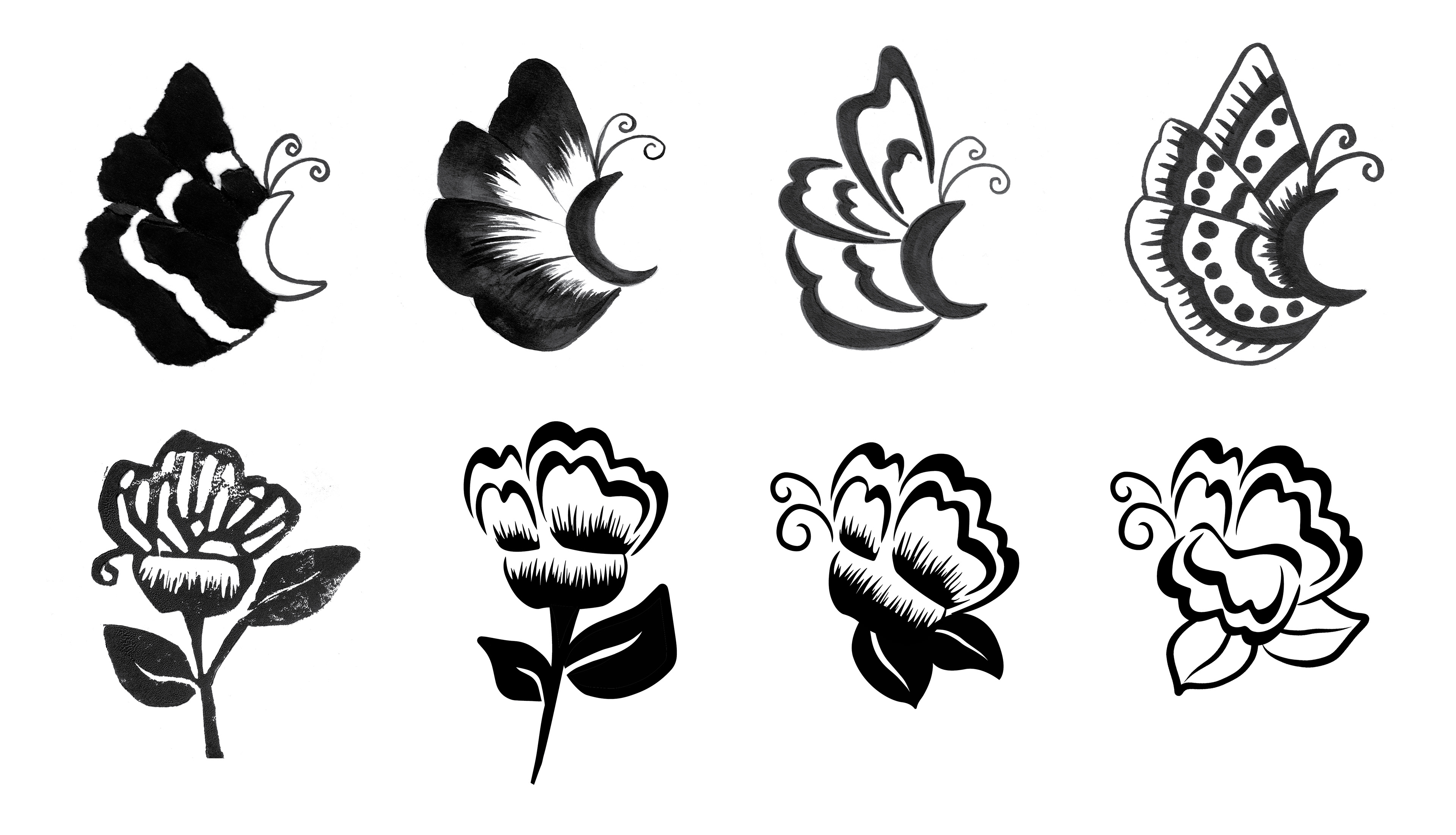
During the logo development phase, I began with research into discovering the essence of butterfly pea flower tea. It is made from a flower native to Thailand, and when steeped it makes a beautiful indigo-colored tea. When a touch of citrus is added, the tea changes to a violet shade. I brainstormed with mind maps and word association lists to come up with a starting point of iconic images to explore for the logo options. Here you can see my word lists, thumbnails, and a few roughs exploring the concepts of butterflies & flowers, as well as some other ideas.
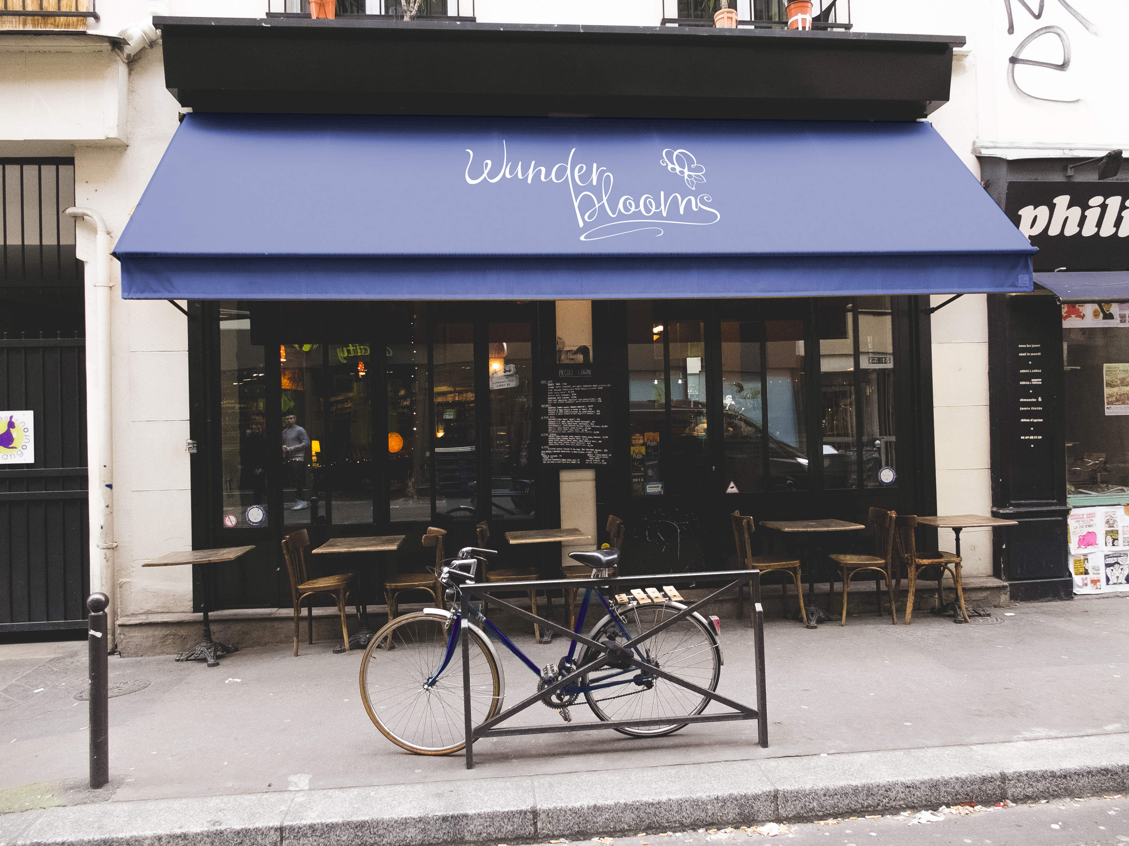
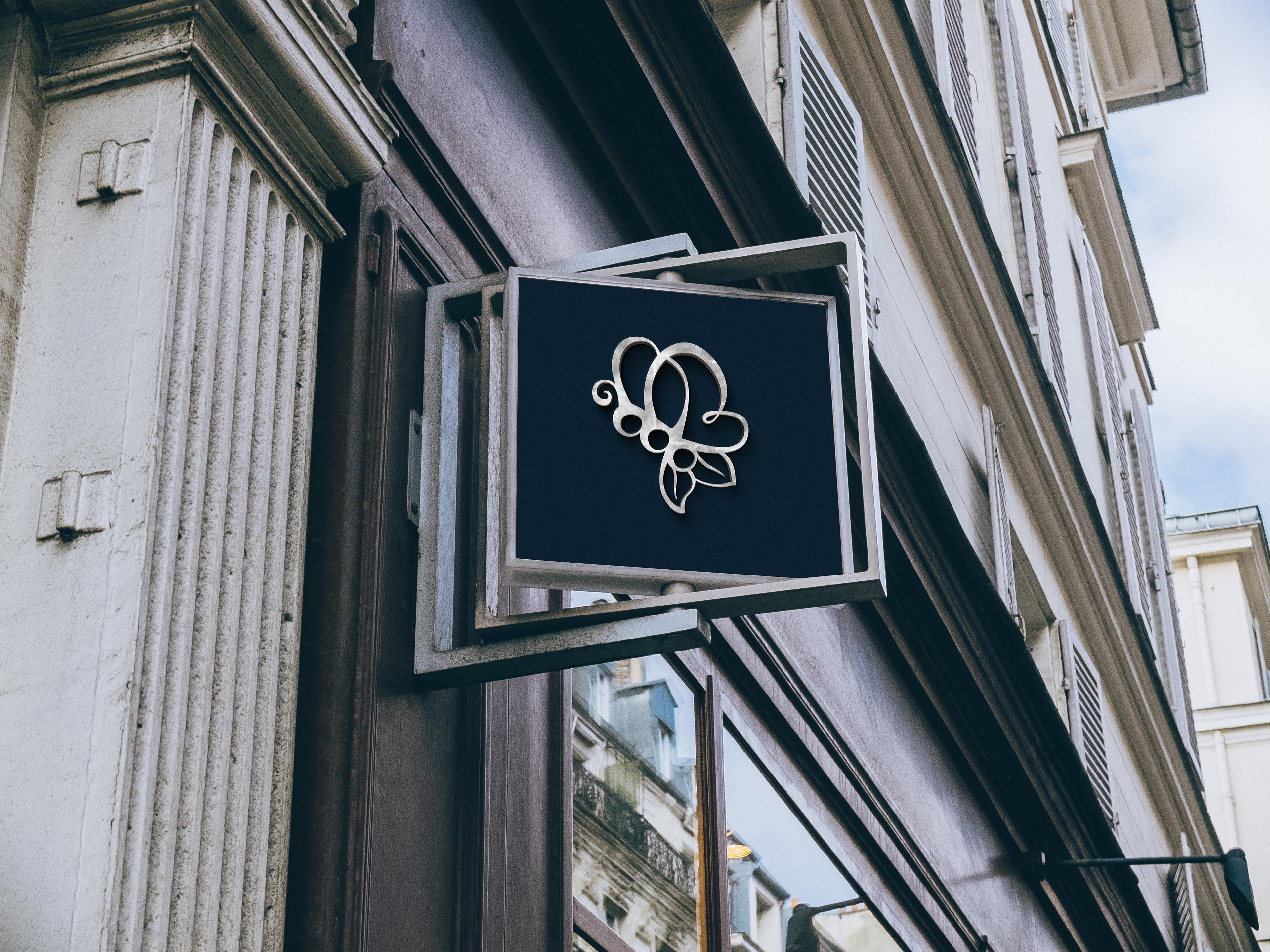
The final logo shown with both black and white grounds.
Process: Wordmark & Signature Development
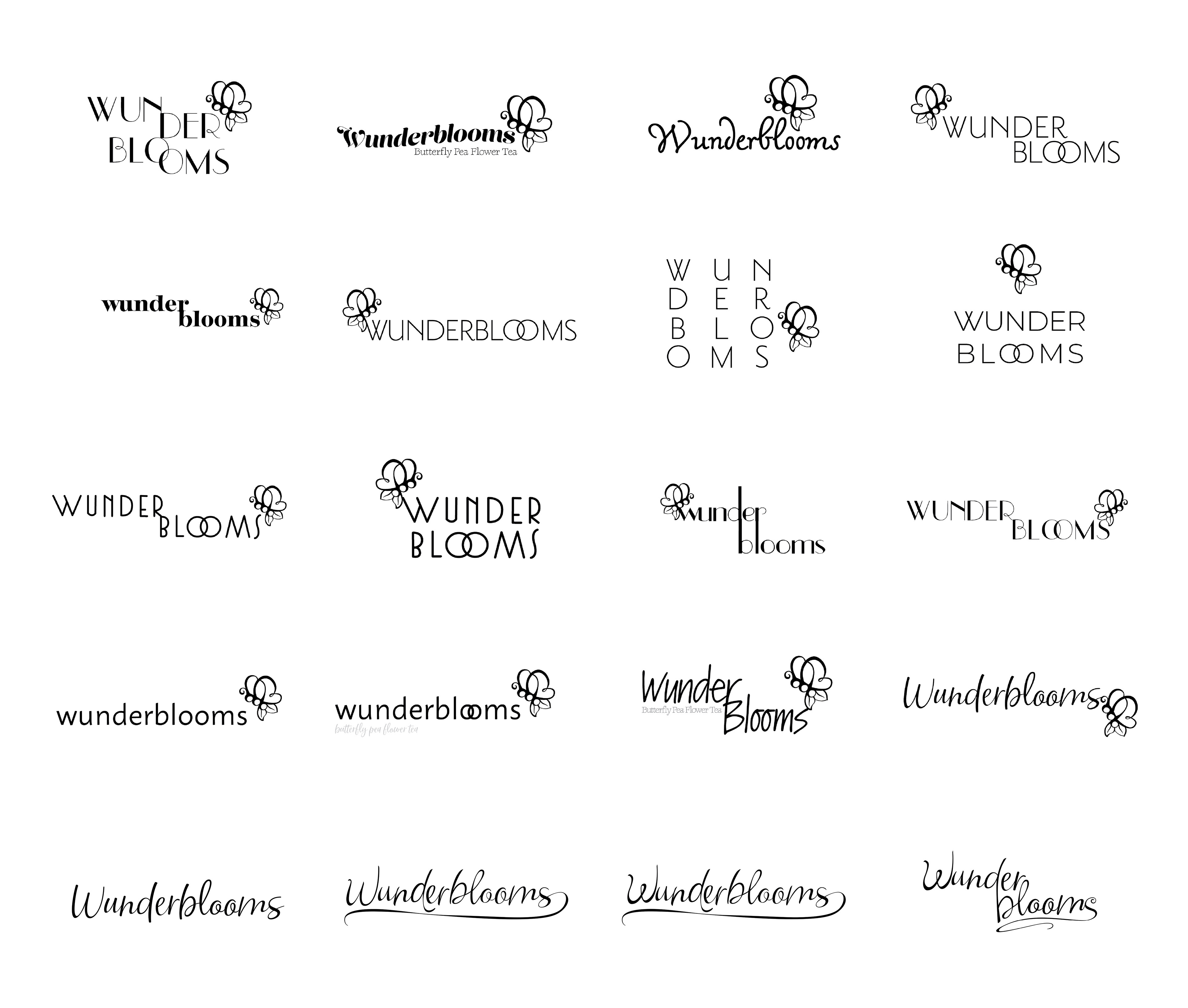
I explored different typefaces for the signature, as well as different ligatures and arrangements of the logo and wordmark. I ended up hand-|ettering the final signature for Wunderblooms. I wanted to emphasize the loops and curves from the logo into the wordmark to play off of the brands' femininity and quirkiness.

Touchpoints
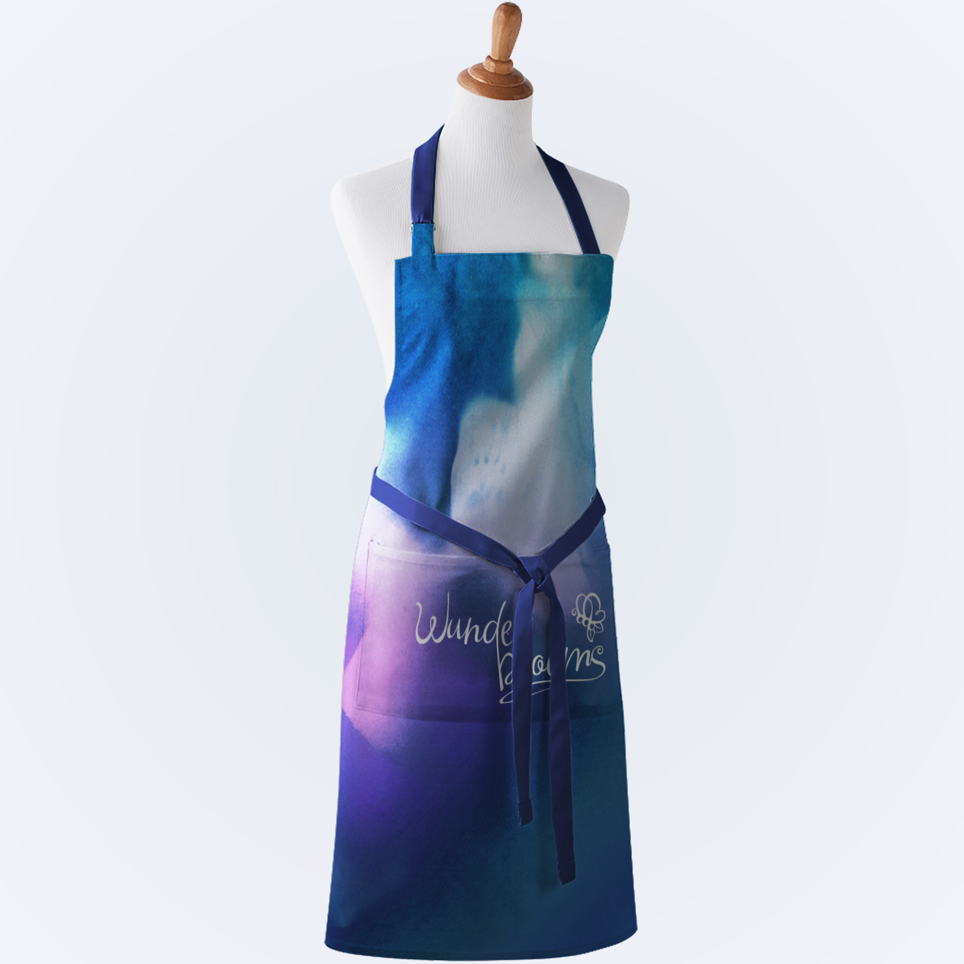
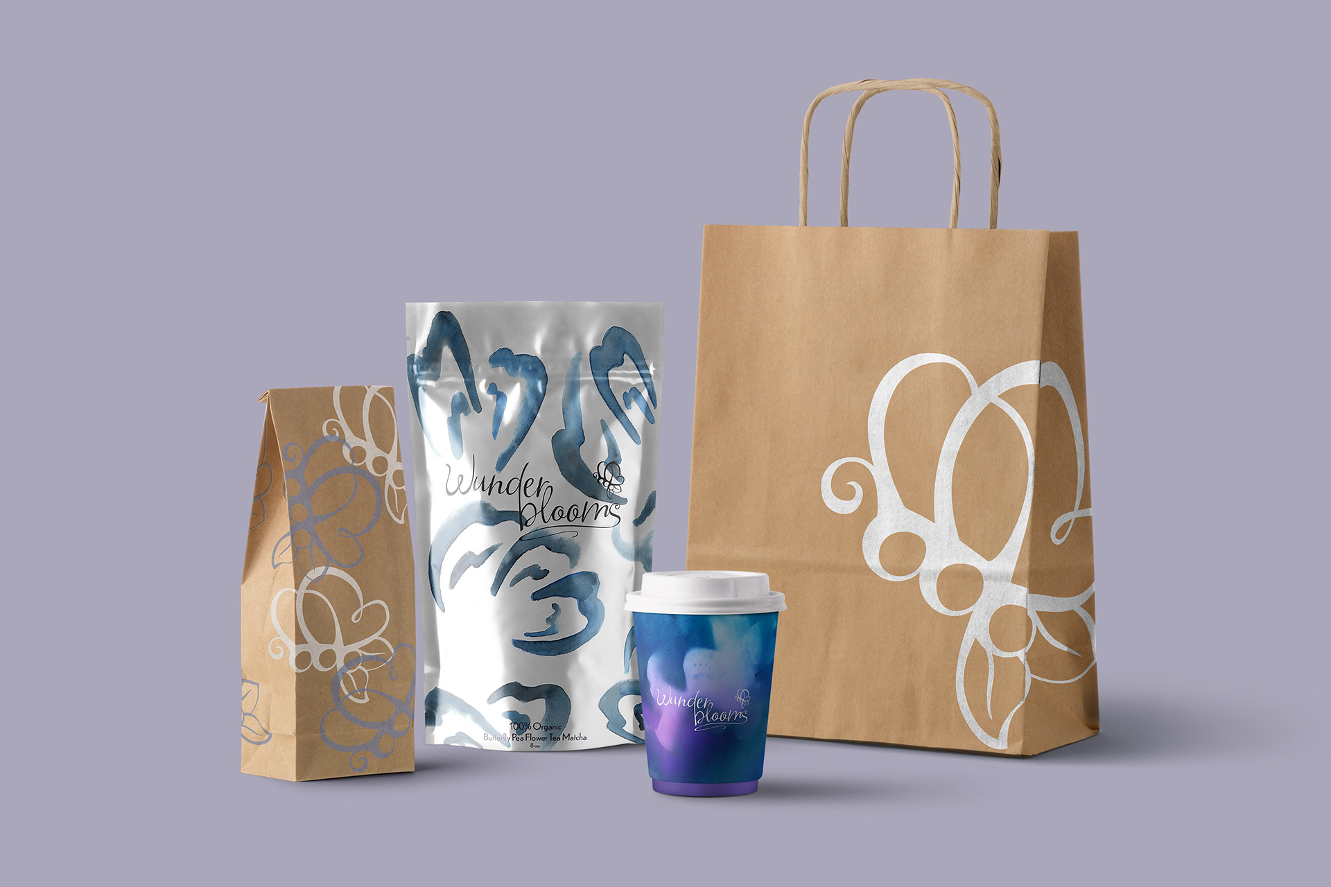
I had a lot of assets from my logo process work that I decided to re-purpose into surface patterns for the brand's packaging. When applying color, I was inspired by the way the tea can color shift between rich cobalt-indigo blues, to a vibrant violet hue. to make the motifs in the patterns, I used a variety of analog techniques, including stamping with handmade linocuts, watercolor, pastels and cyanotypes.
